|
|
|
|
|
|
|
|
|
 Posted: Sat Apr 24, 2010 10:54 am Posted: Sat Apr 24, 2010 10:54 am
 |
 |
 |
 |
Lea Florens http://i14.photobucket.com/albums/a310/ahchyichyi/Englishgentleman_by_Lea.jpg Spanking new completed commission - not quite happy with two things. 1) The right trouser leg cloth folds 2) The glowing gem. That's a gem that he's clasping (the teensy one in the robot hand) - not too sure how to effectively make it 'glow'. The backlighting is blue...but it doesn't seem to be glowing.
Not sure if I qualify to give advice, but I think in this case you may be frustrated with creating a glow effect because there is already so much light in the image. White background, highlights showing a strong lightsource from above, and generally high light all around. Like when you shine a flashlight in a brightly lit room, you're going to have a hard time spotting it.
This is just an experiment. Take the image into photoshop or your image editing program, make a new transparent layer, and fill it with a mid-value of any hue (probably blue or purple to get that shadowy feel). Set it on multiply. Then erase around the area with the gem. Erase any areas that would be hit by the light of the gem.
It's kind of a cliched saying, but there can be no light without darkness and no darkness without light. Right now you've got plenty of light- so much, in fact, that a little more doesn't have much effect. Take some of that light away, however, and we will see the glow of the gem. |
 |
 |
 |
 |
|
 |
 |
|
|
|
|
|
|
|
|
|
|
|
|
|
 Posted: Sun Apr 25, 2010 6:08 pm Posted: Sun Apr 25, 2010 6:08 pm
|
|
|
|
|
|
|
|
|
|
|
|
|
|
|
|
|
|
|
|
|
|
|
|
|
|
|
|
|
|
|
|
|
 Posted: Tue May 04, 2010 8:19 pm Posted: Tue May 04, 2010 8:19 pm
|
|
|
|
|
|
|
|
|
|
|
 Posted: Wed May 05, 2010 2:21 am Posted: Wed May 05, 2010 2:21 am
 |
 |
 |
 |
Pomato Soup This is far too blunt of me, but my initial thought when I saw your most recent image was "what happened?" There is no sense of gravity. Her feet aren't planted, her shoulders are too far back, and when these two things combine it means that she will be on the floor in .05 seconds. Her head also seems a bit wonky, but I can't pinpoint why other than that the face may be too far forward. Otherwise, I like the design overall, and your coloring and linework are wonderful. Even though you said that you "hate shiny stuff" you did amazingly well at portraying the volume and highlights of metal in your previous piece. You are very good at capturing details and textures. It's just that the anatomy seems surprisingly off in this one.
No you're not! I'm grateful for the well thought out crit. smile
Yes, I had a bit of trouble balancing the girl...and it's not something that very high boots can explain away. ^^; (Though her boots are supposed to be really high - just couldn't get it right) I agree it's the shoulders. Probably didn't line her up well enough somehow. =/ I found out what's wrong with the head - the face is supposed to be tilted back alittle, but I didn't follow through with the eye levels (the girl's left eye should be lower), so it turned out alittle odd.
Anyway. Live and learn, hey?
Two more commissions to go~ |
 |
 |
 |
 |
|
 |
 |
|
|
|
|
|
|
|
|
|
|
|
|
|
|
|
|
|
|
|
|
|
|
|
|
|
|
|
|
|
|
|
|
|
|
|
|
|
|
|
|
|
|
|
|
 Posted: Tue Jul 13, 2010 5:10 am Posted: Tue Jul 13, 2010 5:10 am
 |
 |
 |
 |
That one turned out pretty cute, I think.
The main problems I saw with your first one that you posted was just that she seems stiff to me. I know she's to have on a bodice of some sort, but the stiffness still shouldn't be so noticeable. I also think her torso is whoa long for the rest of her body. For women you can usually get away with really long legs, but the torso-stomach-hip area shouldn't be lengthened so much. At least not in my opinion.
I like the top half of the image, but to me it seems like the legs and the rest of the pose didn't come as naturally. I can't tell if she's supposed to be sitting, standing, swinging, whatever. It looks like she's supposed to have a swing under her butt, but I don't see one, and thus, I'm getting confused. xd
I also can't tell which leg is supposed to be forward. She is turned at a non-parallel angle so one of her legs should be larger and moved "closer" to the camera. You might want to consider studying up on perspective a bit too while you're at it. Adding backgrounds really relies on making the character and the background match perspectives. Your image has depth, but certain parts come across as awkward to me due to the perspective funkiness.
Overall, good job on this. I really like your soft coloring with the pencils and stuff. Just work on getting your basic anatomy sketched out before beginning any detail work and pay more attention to things like perspective.
On, and on a side note, she's missing a thumb! xd
|
 |
 |
 |
 |
|
 |
 |
|
|
|
|
|
|
|
|
|
|
|
|
|
|
|
 Posted: Wed Jul 14, 2010 10:03 am Posted: Wed Jul 14, 2010 10:03 am
|
|
|
|
|
|
|
|
|
|
|
 Posted: Wed Jul 14, 2010 10:21 pm Posted: Wed Jul 14, 2010 10:21 pm
 |
 |
 |
 |
syrella The main problems I saw with your first one that you posted was just that she seems stiff to but to me it seems like the legs and the rest of the pose didn't come as naturally. I can't tell if she's supposed to be sitting, standing, swinging, whatever. It looks like she's supposed to have a swing under her butt, but I don't see one, and thus, I'm getting confused. xd I also can't tell which leg is supposed to be forward. She is turned at a non-parallel angle so one of her legs should be larger and moved "closer" to the camera. You might want to consider studying up on perspective a bit too while you're at it. Adding backgrounds really relies on making the character and the background match perspectives. Your image has depth, but certain parts come across as awkward to me due to the perspective funkiness. On, and on a side note, she's missing a thumb! xd
Thank you for the crit, syrella!
I know, I have terrible trouble with anatomy. DX And I only found out about the thumb thing -after- I finished inking (don't you just hate that?)
She's supposed to be standing, actually. Though I guess from the folds of the dress it is alittle hard to see...
mistalina13 Only thing that bugs me a little is the photo background. Maybe try and find a filter setup that compliments your coloring style and flows without ending up so bright? The water color paper effect (at least I think that's what it is) looks nice, but the sky in that image is quite bright. It seems almost a little distracting to me at least.
You're not the first one to comment about the background - I really have to kick my butt in gear and come up with one, methinks. XD It's just that I could just -see- the colors for the image background, but didn't know how to put that down on paper, you know? And thanks, misatalina. =) |
 |
 |
 |
 |
|
 |
 |
|
|
|
|
|
|
|
|
|
|
|
|
|
|
|
 Posted: Wed Jul 14, 2010 10:22 pm Posted: Wed Jul 14, 2010 10:22 pm
|
|
|
|
|
|
|
|
|
|
|
|
|
|
|
|
|
|
|
|
|
|
 Posted: Mon Jul 26, 2010 3:30 pm Posted: Mon Jul 26, 2010 3:30 pm
 |
 |
 |
 |
The freebie you did is really cute. <3 The only thing I would say is that you should use guidelines a bit more to get everything lined up properly. It seemed very lopsided to me. Do this before going in for all of your detail work.
Same with the full body image you'd done. The lines and the coloring are all very beautiful, along with the nice rendering of the fabric, but you just need to work on the form a bit more. One tip that I have is that you try sketching out the basics such as the torso, the head, the hips, spine, etc. Get an idea of where you want everything to do. Then start fleshing the figure out without trying to add clothes and other details. Finally, when you get everything in the right place and looking nice, only then should you go in for all of your colors and inking and stuff. Try out this method for one or two pieces. If you find you can't stand it, then go back to what you were doing. Sketching out a piece beforehand has really helped my art, though. ^_^ So I'm speaking from personal experience.
If you have any questions, feel free to let me know.
|
 |
 |
 |
 |
|
 |
 |
|
|
|
|
|
|
|
|
 |
|
|
|
|
|
|


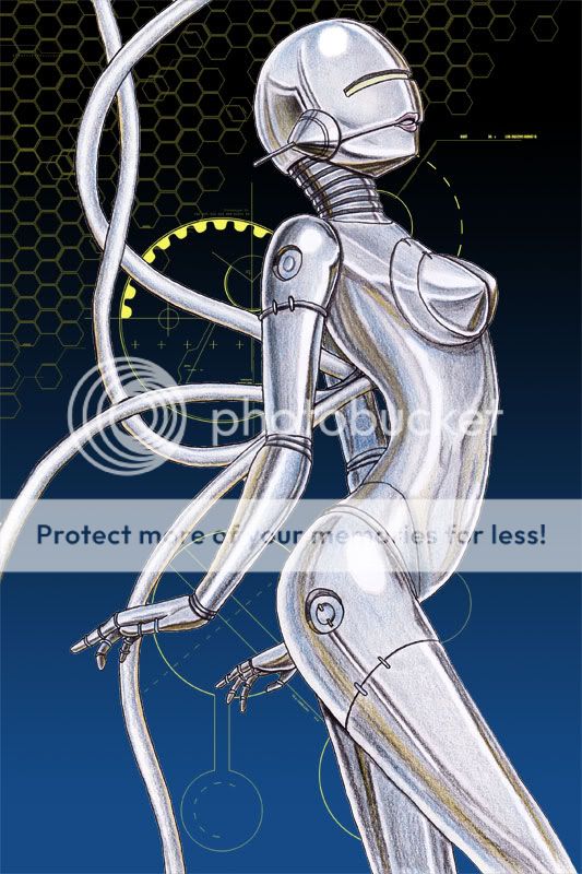
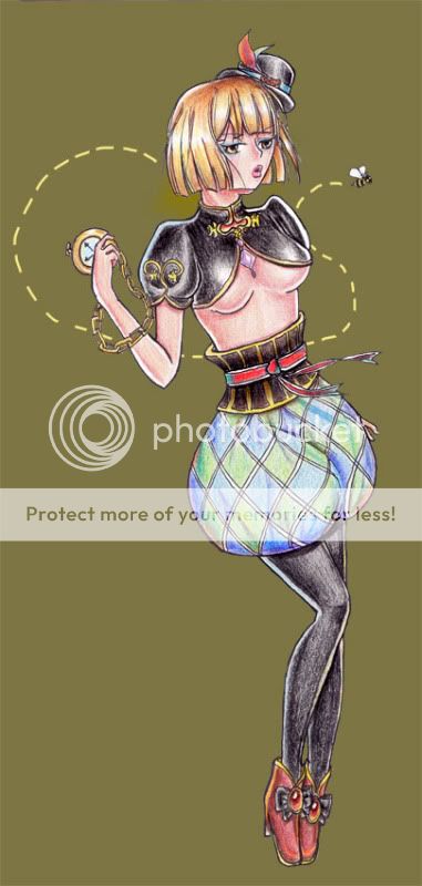 Latest work.
