|
|
|
|
|
|
|
|
|
 Posted: Sat Sep 05, 2009 11:17 am Posted: Sat Sep 05, 2009 11:17 am
|
|
|
|
|
|
|
|
|
|
|
|
|
|
|
|
|
|
|
|
|
|
Posted: Sun Sep 06, 2009 12:53 am
 |
|
|
 |
Umm... yeah, definitely!
I'm not sure how much help I'd be, though, you seem pretty good, still if you wanna go through with this...
go to PoseManiacs, pick one, sketch it, and show it to me. Try to pay a lot of attention to how and where the muscles attach to the bones, it looks like that's one of the flaws in your drawings. Also, make sure you have a firm idea where the spine is in the person you're drawing; the first sample you've shown me's back is crooked. I tend to sketch it in first, before I go any further, because that's the core on which everything builds.
|
|
|
|
|
|
 |
|
|
|
|
|
|
|
|
|
|
|
|
|
|
|
|
|
|
|
|
|
|
|
|
|
Posted: Mon Sep 07, 2009 7:55 am
|
|
|
|
Mmkay, then :3.
On to the assignment!
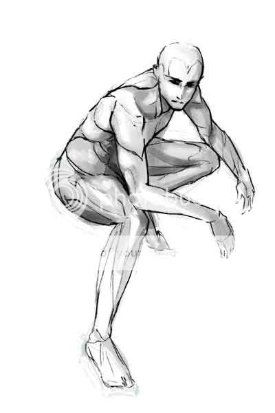
First off, the weight on his foot is not right. If he can support all his body weight on his toes like that whilst crouched with his legs out that far, he must be a damn good ballerina. You'll probably need to flex his foot so that his weight is on the ball, as opposed to the toes.
Also, you did a really good job of showing where the muscles are, up until the back. This should give you a pretty good general idea of where the muscles on the back fit. From the angle we're at, we should probably only see his lats and external abdominalis(es?). From what I can see it looks like you did a great job on the torso muscles, though.
Okay, next, erase the internal lines of the muscles, leaving the more prominent contours, and draw clothing over it, paying close attention to where wrinkles would fold and drape. Draw in some hair and details, etc. but don't color it yet.
(Basically, the way this is gonna work is I'm going to go step-by-step with you through finished pieces, but with different techniques and I'll supervise less of the steps as you improve.)
You're more than welcome <3.
|
|
|
|
|
|
|
|
|
|
|
|
|
|
|
|
|
|
|
|
|
Posted: Mon Sep 07, 2009 8:58 am
|
|
|
|
|
|
|
|
|
|
|
|
|
Posted: Mon Sep 07, 2009 9:49 am
|
|
|
|
|
|
|
|
|
|
|
|
|
|
|
|
|
|
|
|
|
|
|
|
|
|
|
|
|
|
|
Posted: Wed Sep 09, 2009 3:26 pm
|
|
|
|
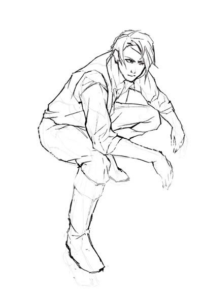
On the WIP:
-The middle of his upper torso doesn't align with his lower torso, but he doesn't look like he's twisting.
-His butt is slightly too big, and his waist doesn't taper into it right.
-His thigh is too low. I understand you leaving room for his junk, but you have to still account for the fact that his thigh connects at the top of his pelvis (I'm counting his butt and his thigh as one)
-It doesn't taper down to his knee correctly, which it needs to.
-The way you drew his legs makes me think I'm looking down at him, but his torso and head make me think I'm level with him. Which is it? (Depending on which it is, this or this should help.)
-Lastly: his arm that's further away from us is foreshortened badly, his forearm should be shorter than his upper arm if it's pointing away from us.
On the assignment:
Looking pretty good! Weight is much better distributed now. His facial features are set right in the middle of his face, even though it's a 3/4 view, which makes it look really distorted. They should follow a centerline drawn down the middle of his head. Ear is a bit too big and a teensy bit too high (should end around halfway up that slash on his forehead). Hair seems to be flowing awkwardly as well, try to make it smoother, and remember that it is one of the parts of the body most affected by gravity. No real complaints other than that, but if you're really feeling up to it, then try to think about the material of his clothing, and add thickness to it.
Next assignment!
Color it! Sounds simple enough, yes? If you know much about color theory, then that's great, try to use a bit of a color scheme, but don't overdo it. If you don't know about color theory, don't worry about it too much, and just color it in a way you think looks good.
|
 |
|
|
|
|
|
|
|
|
|
|
|
|
|
|
|
|
|
|
|
|
|
Posted: Wed Sep 09, 2009 9:32 pm
|
|
|
|
|
|
|
|
|
|
|
Posted: Wed Sep 09, 2009 9:34 pm
|
|
|
|
|
|
|
|
|
|
|
|
|
|
|
|
|
|
|
|
|
|
Posted: Fri Sep 11, 2009 3:40 pm
|
|
|
|
XD I'm sure they will. I think I'm gonna have you crit some of my older stuff (and some of your own) to start developing your eye, because it's an important skill to have.
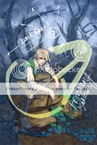
About the picture:
His head is looking good. The ears aren't as crucial now, as he has pointed ears, which aids the suspension of disbelief, but just keep that in mind for next time. I think we should be able to se a little bit more of the front of his shirt, as well as a bit of the other sleeve on that vest. When you go in to shade in detail, make sure you define his fingers with shading, because you're not doing it with line, also, make sure the folds and gathers on his shirt correspond to your lines, because I can see a couple where the line goes directly against the shading. Make sure you add some dimension to his foot, 'cuz it's looking kind of flat right now.
Lastly, about your choice of light sources. It says that the blue is your backlight, but I'm seeing a lot more blue in the picture than yellow, so maybe downplay the sunlight? The contrast of the warmth of the character is a bit too much against the cool background. I'm not saying get rid of one of the light sources, but I suggest either make the blue your primary source, or change the color of the backlight. (Green might look nice, but it'd probably alter the feel of the picture too much.)
You're definitely on the right track.
|
|
|
|
|
|
|
|
|
|
|
|
|
|
|
|
|
|
|
|
|
|
|
Posted: Sat Sep 12, 2009 4:07 am
|
|
|
|
|
|
|
|
|
|
|
|
|