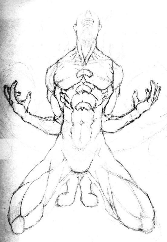
Welcome to Gaia! ::

Gaian Art Mentors

Back to Guilds

Where artists are paired in a mentor/mentee fashion to share their knowledge. 

Tags: artists, mentor, mentee, learning, drawing 

Reply Sketchbooks [Get crits here! Open to everyone]
Anpu's Sketchbook (Updated 01/24/11) Goto Page: [] [<] 1 2 3 4 [>] [»|]

Quick Reply

Enter both words below, separated by a space:

Can't read the text? Click here

Submit

Do you like my style? Is there potential?
Don't quit your day job. Drawing's not for you...
11%
 11%  [ 3 ]
Sure, just keep at it...
88%
 88%  [ 24 ]
Total Votes : 27


Anpu the black Seraph

PostPosted: Mon Jul 14, 2008 8:32 pm
The Martian
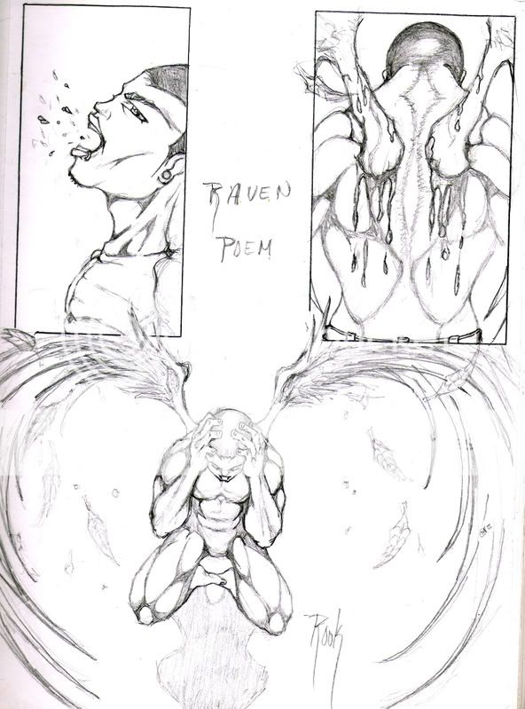
First one: His face is skewed! However, good job on the expression.

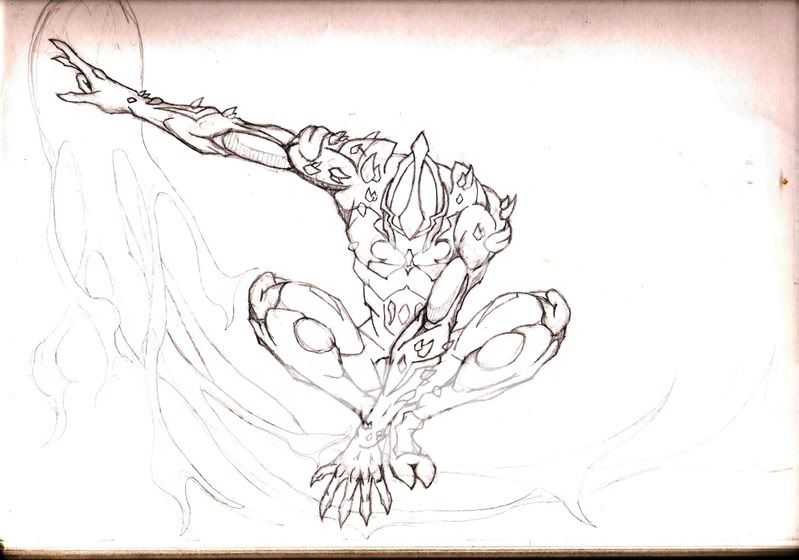
2nd one: Plaques don't fly like that... I'm not sure about the position of the left thigh (our left). Maybe move things in a bit? The foreleg looks fine though, just not the back part.

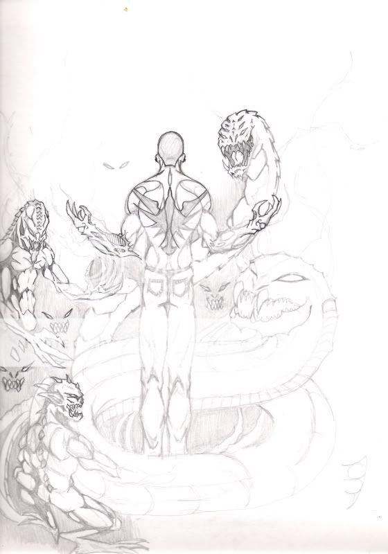
You might want to start relying less on lines an more on values to define shadows and highlights.


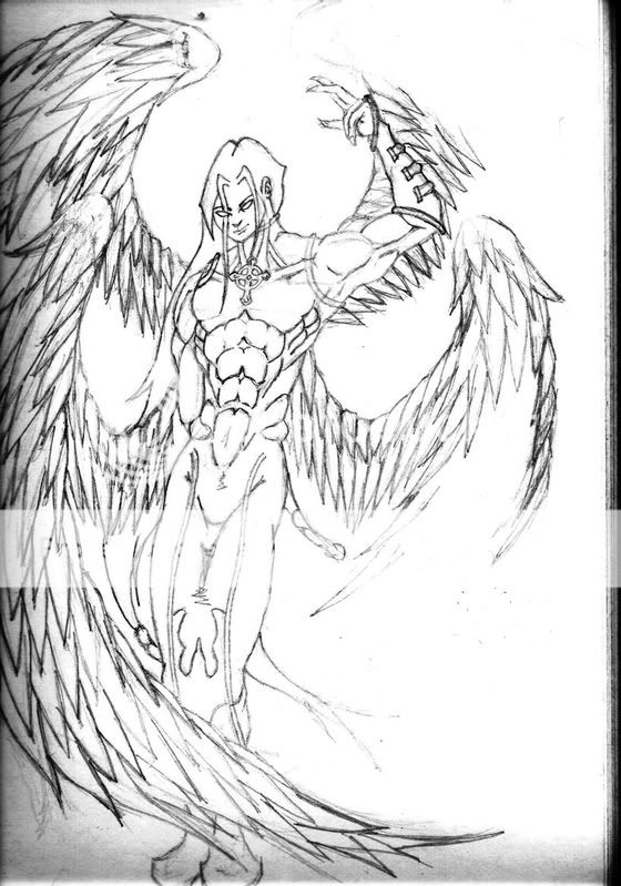
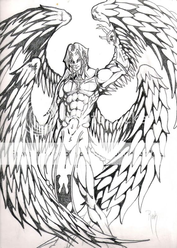
I kinda see what you mean by the face in the first pic, how the head is somewhat mis-shaped. But I have to admit that I used a nude model as reference for the second pic, so the pose should be fairly accurate. I did change the angle of the head, and I think it may be a little off. The original has a lot more values that didnt seem to transfer during the scan. I'll have to darken them more from now on.

Thanks.
 
PostPosted: Sat Jul 19, 2008 7:58 am
I've mostly only started the outline of this image. I'm havin serious problems with the positioning of the head and its facial features. I can't seem to figure out how to draw the head tilted back- mouth open. He's supposed to appear as if he's in a rage...like something bad happened. Something's off about the arms too. Any suggestions, especially for the head will help a lot.
User Image  

Anpu the black Seraph


Anpu the black Seraph

PostPosted: Wed Jul 23, 2008 10:45 pm
My current WIPs. Two of my favorite characters; only basic sketches. As I'm sure It's pretty obvious, I've yet to do any shading or line depth in these sketches. I'm mostly looking for pose, anatomy, and proportion suggestions. Anything else is golden. As always, red-lines are incouraged. Also, the schetches were really lot so I darkened them, obviously.

User Image
Dragonmage 7/26/2008


User Image
Beauty of the Black Seraph 7/27/2008
 
PostPosted: Sat Jul 26, 2008 8:58 am
In the dragon one, I think the only thing that isn't working is the placement of his hand. He's supporting his weight on it a bit to not tip forward, but his hand isn't placed in a way that does that. I suggest getting into poses yourself. That helps you find where things should be placed in order to have balance.

User Image

Same goes for the second one. He'd be on his a** standing like that. The head will generally be over the standing leg, or between the feet if the weight is evenly distributed. (edit) I messed up the red for the working leg. I'd say to go with the green since that's more correct Ignore the red legs. gonk

User Image

I notice that you're not considering how much space the mass of the bodies will be taking up and you're drawing things so that there is no room for other parts.

User Image

I really need to stop being lazy and work on that figure study thread. -_- I'm repeating a lot of things when I could just refer to that.  

Errol McGillivray
Captain


Anpu the black Seraph

PostPosted: Sun Jul 27, 2008 1:17 pm
Thanks for the great reviews Errol, as always. And the red lines are most definately appreciated. Means a lot. I know I have a long way to go to get where I want to be. But of course, practice makes perfect.  
PostPosted: Fri Aug 08, 2008 6:08 am
Well, understanding how things work and WHY you're doing things to get certain results along with practicing habits that demonstrate that understanding will do that. Practice without direction or practicing the wrong things won't get you very far and it certainly will slow things down.

You'll get where you need to be though. There's resources all around us to use. Your own body, for one. Get a full body mirror (they are usually about 20 at walmart or something like that).  

Errol McGillivray
Captain


Anpu the black Seraph

PostPosted: Tue Aug 19, 2008 8:29 am
Anyone have any tips on general shading and/or coloring? Those are two things im really kinda struggling with. Thanks?  
PostPosted: Tue Aug 19, 2008 1:05 pm
Shading, and how you're going to want to shade, is really going to depend on the paper you're using. My paper of choice for pencil shading is this really fabulous marker paper ("Bee Lady" brand or somesuch), because the smooth finish they put on it for the markers takes the pencils really smoothly, and it erases like a dream.

This allows me the opportunity to do .. probably my favourite shading-related stunt, which is to put on a lot of really dark uniform pencil shading, and then render hilights with the eraser. As seen here on her top & sleeve.
With this paper, I prefer to use a mechanical pencil.

If I'm not using marker paper for shading pencils, second choice is bristol, which doesn't erase nearly as well so I have to be a lot more careful when I put colour down really hard - it won't lift off, and it may even indent the paper. As such, "careful measures" are called for. I generally use the H2, H, B, and B3 or 4 pencils with bristol, but I have a set of 8B-2H and pencil selection often just goes all willy-nilly.
Anyway! Careful measures. Starting with the lightest pencil, making light passes over the parts I want shaded, repeating with darker and darker pencils, E T C.
EG the arms on this dude.


Anyway I'm probably not saying anything helpful, uh, rendering spheres! Hatching! Crosshatching! Think in 3D!


.. As for help colouring, what are you colouring with?
 

clocktock


Anpu the black Seraph

PostPosted: Wed Oct 01, 2008 6:41 pm
I think I'm almost finished with this piece. I tried to use everyones suggestions and I think it does look a lot better. What do you think?


User Image
10-01-08


This next one is something new I've been doodling with. I don't Know. It's starting to look kinda cool. A weak attempt at sequential art but an attempt none the less. It really is just a sketch; I haven't added any line depth or value. I kinda wanted to see what everyone would suggest before I went any further. Anyways...let her rip. How am I doing.


User Image
10-01-08
 
PostPosted: Tue Oct 07, 2008 3:24 pm
Your work this time around is making some serious strides. Good stuff.

I'm going to go a little advanced on you because I think for your angel one, you're ready for it.

The image looks flyswatted. The term means that things are going in too many directions, like a smashed bug splatter. Also, it makes things very flat.

Establish a general line of action and stick with it. Have the elements flow to lead the eye around the image. Your line seems to be coming from the upper right down through the leg. You can keep that upward thrust by lowering the wing on the left. The wings on the right already follow it.  

Errol McGillivray
Captain


Anpu the black Seraph

PostPosted: Fri Oct 10, 2008 3:27 pm
Errol McGillivray
Your work this time around is making some serious strides. Good stuff.

I'm going to go a little advanced on you because I think for your angel one, you're ready for it.

The image looks flyswatted. The term means that things are going in too many directions, like a smashed bug splatter. Also, it makes things very flat.

Establish a general line of action and stick with it. Have the elements flow to lead the eye around the image. Your line seems to be coming from the upper right down through the leg. You can keep that upward thrust by lowering the wing on the left. The wings on the right already follow it.


Do you mean the top left wing, or both? I think I see what you mean by the overall flow of the image moving left to right though. I'll see if I can fix it without ruining it. Any suggestions for the second piece?
 
PostPosted: Fri Oct 10, 2008 4:06 pm
I'd say start with the top. Experiment. I say you should make copies of the original rather than mess with it. You can just turn down the opacity and print it out. Or draw it again on a fresh sheet. Trust me, you'll draw stuff over a lot. it's not big deal.

For the second one, I wouldn't worry about it. It's an improvement from past ones.  

Errol McGillivray
Captain


Elixias

PostPosted: Sat Oct 11, 2008 9:30 am
Well, I don't have any critic to give at the moment, but just want to say how great I think your knowledge on anatomy is. The muscles in your art are very defined and the shadings bring life to them. biggrin  
PostPosted: Thu Nov 13, 2008 3:23 pm
My current work in progress. After I started it it kind of became a revamped version of an older drawing I did a few years ago. Not Intentional at first but I went with it. Not any where finished yet either; I still think it looks a lot better than the original. I think I've improved a little at least.

The main character from the primary book I'm writing, the surrounding demons in this pick are admittedly influenced by the character The Darkness: property of Top Cow productions. Let me now what you see wrong or any suggestions you may have before I finish this baby.


The original drawing; prob about a few years old.
http://i102.photobucket.com/albums/m92/TaooftheRaven/RavenMoon-Demons.jpg


My work in progress. Not as improved as I could be, but I have gotten a little better.

User Image  

Anpu the black Seraph


Elixias

PostPosted: Thu Nov 13, 2008 7:26 pm
I'm not so sure viewing someone from the back would show so much of the biceps (but I could be wrong). It's not very obvious, but something about the anatomy is troubling me here. I'm not sure why...

Maybe cause I'm fooled by the details, they're good. Lots of details shows how much effort you put into the work, and I think that's one thing that every art should have.

Edit: I know what's bothering me now. The biceps are showing too much, so it looks like the hands are actually too wayyyy tooo pulled back. (Either that or their actually facing the front, eg: towards the viewer).

A more dynamic pose would be to pull his arms all the way to the sides, tilt his head back. Just a suggestion, don't need to take it if it's hard to swallow XD  
Reply
Sketchbooks [Get crits here! Open to everyone]

Goto Page: [] [<] 1 2 3 4 [>] [»|]
 
Manage Your Items
Other Stuff
Get GCash
Offers
Get Items
More Items
Where Everyone Hangs Out
Other Community Areas
Virtual Spaces
Fun Stuff
Gaia's Games
Mini-Games
Play with GCash
Play with Platinum