Welcome to Gaia! ::

Gaian Art Mentors

Back to Guilds

Where artists are paired in a mentor/mentee fashion to share their knowledge. 

Tags: artists, mentor, mentee, learning, drawing 

Reply Mentor Threads [Dedicated Mentoring here!]
Vena -- Open Redline/Critique Thread Goto Page: [] [<] 1 2 3 ... 4 5 6 7 8 9 [>] [»|]

Quick Reply

Enter both words below, separated by a space:

Can't read the text? Click here

Submit

.[ Cheesecube ].

PostPosted: Wed Oct 17, 2007 5:26 pm
Vena
.[ Cheesecube ].
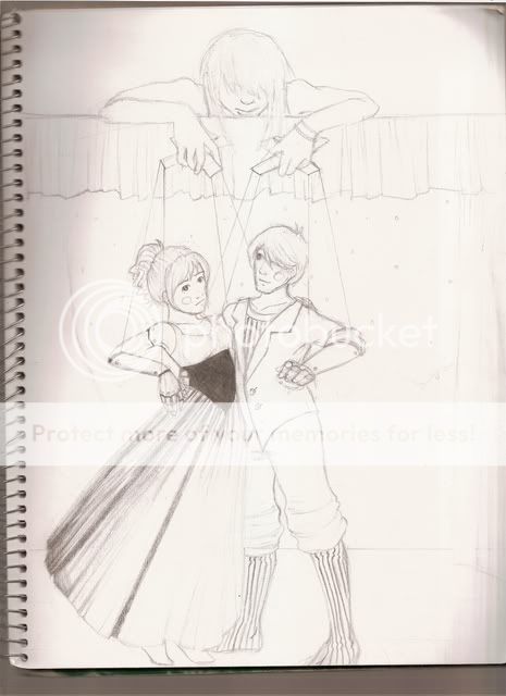
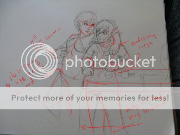
Kay, soo, for school we had a project where we had to hide crap and stuff... I came out with a sketch, but it's.. bad. : / [I figured I would fix the face more when I could draw it bigger... But I'sa be badd with bodiess.]

Here's a link


Ok, well with this picture I can see where you are going with it, I like the face on the body.. maybe think of a better way to 'hide' it in the picture, right now its just kinda floating on her body. You could integrate it by using similar lines together, like say the curve of her stomach as the curve of her cheek. Otherwise it feels a little dispaced.

There are a couple of anatomical problems, mostly just with her torso. The breasts should be a little more stretches, so the breasts should be a bit lower. The (our) left side of her body is also a little too far out. The hands and fingers are also a little too large. I really like the contour around her head and shoulders =)

I hope that helps you a bit with your sketch.

Yes, it does; Thank you! ^^  
PostPosted: Wed Oct 17, 2007 5:40 pm
Vena
Well first off, the bodies look very nice =D Nice composition too. However! you need to widen your range of colors, kris!! There are millions of colors! hehe =D Right now you use very saturated tones, and for stuff in the background, you should stick to muted or desaturated colors. While red is a nice color for the drapes, if you use a velvety dark green or blue it will make the read coat on your main character brighter. Right now it is much too bright of a red so try to tone it down a bit. Also since the flowers in the front are so close to the viewer, try to tone them down a bit too, just keep their presence but not so much detail =3


*rofl* Yes... red....isn't...the only...what was I saying ? xd

....I'm trying it out-- the blue muted color...actually looks nice.
Oh, and I'm feeling lucky that you're almost always online...

It's like this thread is the only thing pulsing 'round here since I joined.
Yet again my fondest thanks--
 

Solus_Nyxx

Beloved Genius

6,750 Points
  • Person of Interest 200
  • Signature Look 250
  • Forum Sophomore 300

I.P.Freely

PostPosted: Sun Oct 28, 2007 5:42 pm
Oh, oh! Can I be the third mentee biggrin

Here's my portfolio: http://emihaumut.x10hosting.com/index.php I'm slowly trying to transition away from manga and into realism and I would love some help smile  
PostPosted: Tue Oct 30, 2007 7:14 pm
sure =)  

Vena

5,300 Points
  • Hygienic 200
  • Gaian 50
  • Treasure Hunter 100

I.P.Freely

PostPosted: Tue Oct 30, 2007 8:11 pm
yay! biggrin

Well here's a piece I'm working on smile
User Image - Blocked by "Display Image" Settings. Click to show.
Basically, this is a picture of a hero. The guy is supposed to be my D&D paladin on his warpony and he's holding a hero sandwich smile

I've noticed his tuft of hair in the front is bugging me, so I'll be changing that during the inking phase. Ignore the background, it was by no ways a serious background. I just wanted to draw something silly. I'll add a more serious background during the inking phase.  
PostPosted: Wed Oct 31, 2007 4:20 pm
I think the first thing I notice is that the horse is very, very small. Horses are quite large animals =O you should look up some riding pictures to get a better idea of the comparison. I like the stylization you are going for in the picture, especially the horses head.  

Vena

5,300 Points
  • Hygienic 200
  • Gaian 50
  • Treasure Hunter 100

I.P.Freely

PostPosted: Wed Oct 31, 2007 4:42 pm
Ahhh, yeah, I wasn't too sure how to draw a pony, but I see your point. Time to fix in photoshop smile Thank you.  
PostPosted: Fri Nov 09, 2007 7:35 pm
Allright, soo...

I finally got some time to work on something! biggrin

User Image

Here's my pencil drawing; I'm going to shade it, and then also do a digital copy..

So. Um.. If you notice any errors before I set to work on line-arting it, that would be awesome; Also, I'm still unaware of what I want the colors to be.. I'm afraid I'll pick bad ones. >w<  

.[ Cheesecube ].


Vena

5,300 Points
  • Hygienic 200
  • Gaian 50
  • Treasure Hunter 100
PostPosted: Mon Nov 12, 2007 2:04 pm
Nitpicking - on the puppeteer one arm is a bit longer than the other, and on the puppets the hips go up a bit high (though in the image, it still works). It looks great otherwise!  
PostPosted: Tue Nov 13, 2007 9:13 pm
Vena
Nitpicking - on the puppeteer one arm is a bit longer than the other, and on the puppets the hips go up a bit high (though in the image, it still works). It looks great otherwise!

Thanks. ^_^ Any idea's on what I should use for colors?  

.[ Cheesecube ].


Vena

5,300 Points
  • Hygienic 200
  • Gaian 50
  • Treasure Hunter 100
PostPosted: Wed Nov 14, 2007 3:57 pm
hmm I guess it depends what theme you are going for razz If they are just standard sorts of puppets using some 'true' primary colors would be nice, because it sort of reflects on them being just some sort of decorative wooden puppet. If they are representations of other characters I guess color them to represent them.  
PostPosted: Mon Dec 17, 2007 5:11 pm
So, this is for a contest, and something is wrong, I just don't know what. :s

http://cheesecube.deviantart.com/art/WIP-For-a-contest-72364743  

.[ Cheesecube ].


Vena

5,300 Points
  • Hygienic 200
  • Gaian 50
  • Treasure Hunter 100
PostPosted: Thu Dec 20, 2007 3:24 am
I hope this helps a bit
User Image

- the girl on the right is very tilted forward to the point where she is kinda crossing through the table
- the girl on the left leaning is kinda falling, just a small hip adjustment will balance her out
-the girl on the left's eyes are not lined up according to the head
-in general the hands are quite large and chunky, the wrist area needs a little more defining
I hope that helps you a bit : o  
PostPosted: Thu Dec 20, 2007 10:00 pm
Vena
I hope this helps a bit
User Image

- the girl on the right is very tilted forward to the point where she is kinda crossing through the table
- the girl on the left leaning is kinda falling, just a small hip adjustment will balance her out
-the girl on the left's eyes are not lined up according to the head
-in general the hands are quite large and chunky, the wrist area needs a little more defining
I hope that helps you a bit : o

Thank you!! I wasn't even thinking about the hand size; they will definately be shrunk! Also, thank you for the tips on how to balance them- I have awfull trouble with that. >w<  

.[ Cheesecube ].


Vena

5,300 Points
  • Hygienic 200
  • Gaian 50
  • Treasure Hunter 100
PostPosted: Fri Dec 21, 2007 5:12 am
one of my problems is I usually make hands too tiny xD  
Reply
Mentor Threads [Dedicated Mentoring here!]

Goto Page: [] [<] 1 2 3 ... 4 5 6 7 8 9 [>] [»|]
 
Manage Your Items
Other Stuff
Get GCash
Offers
Get Items
More Items
Where Everyone Hangs Out
Other Community Areas
Virtual Spaces
Fun Stuff
Gaia's Games
Mini-Games
Play with GCash
Play with Platinum