|
|
|
|
|
|
|
|
|
 Posted: Sat Nov 03, 2007 5:21 pm Posted: Sat Nov 03, 2007 5:21 pm
|
|
|
|
|
|
|
|
|
|
|
Posted: Sat Nov 03, 2007 5:27 pm
|
|
|
|
|
|
|
|
|
|
|
|
|
Posted: Thu Nov 08, 2007 7:21 pm
|
|
|
|
|
|
|
|
|
|
|
Posted: Thu Nov 08, 2007 7:30 pm
 |
|
|
|
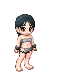
Ishrie @Pirate: Thank you very much for replying! I'll definitely add it in now, since other people are noticing it, too. And I would love to see it. surprised @Errol: Oh, thank you! That's extremely helpful, I'll redo the sky right away. I did Google up a couple pictures before I started coloring it, but I never thought to actually take notes down. That's very clever. surprised Also, I see what you mean about the feet, but the hands look like they're slightly larger than they should be, which was intentional. http://img.photobucket.com/albums/v634/Ishrie/isitcanbeWIPtiemnow2.pngI was taught that with hands, one can always make them larger than they should be (because they'll still be believable up to a certain point), but they can never be smaller. I usually draw them larger because it makes it easier, but I'll change them along with the feet if you think it'll make it look better. Thanks again, you guys!
Spread your hand over your face and feel where your fingers go. Your entire face will be covered. I think the problem with the hand is that the fingers should be more substantial. Anyway, check out that diagram. I found it to be helpful. |
 |
|
|
|
|
 |
|
|
|
|
Errol McGillivray Captain
|
|
|
|
|
|
|
|
|
|
|
|
Posted: Thu Nov 08, 2007 9:21 pm
|
|
|
 |
Hoshizz, more comments? You people are lovely!
@Yuri: You know, it's so funny you should mention that. I struggled hardcore with the face, and what I have now is just what I settled with. It's so nice to hear something definite that I can actually fix! I'll get right on that.
@Errol: Wow, you're very right. And here I had no idea. sweatdrop I'll get right on it, and check out that thread. Thank you very much!
old
'Kay, so I was about ready to kill myself over the texturing on the moon, when I started going it over with crazy combinations of basically every textured brush I had. Well, I eventually got to RedHeadStock's Special Effects brushes when I found something that looked right! It was amazing! Funny thing is, though, is that when I went back and looked at the pattern again at the resolution I had painted it at, it turned out that the brush I had used was actually a flower stamp. xp Ah, well. You gotta do what you gotta do!
I'm still thinking about going back and adding more gray to the moon. I dunno why, but it just seems a little too cold to me, even though I'm using a pretty cold color scheme. Then again, I'm not so sure that it'd cast off that same light blue onto the rest of the picture if it were gray(er).
So, I'm gonna go back and fix hands and faces. 3nodding Thanks again, you guys! I couldn't have gotten this far without you. Well, I could've, but the result would have been gross. gonk
|
|
|
|
|
|
|
|
|
|
|
|
|
|
|
|
|
|
|
|
|
Posted: Thu Nov 08, 2007 9:45 pm
|
Errol McGillivray Captain
|
|
|
|
|
|
|
|
|
|
|
|
Posted: Thu Nov 08, 2007 9:58 pm
|
|
|
|
|
|
|
|
|
|
|
Posted: Sat Nov 10, 2007 4:58 pm
|
|
|
|
|
|
|
|
|
|
|
|
|
|
|
|
|
|
|
|
|
|
Posted: Thu Nov 15, 2007 10:54 am
|
|
|
|
|
|
|
|
|
|
|
|
|
Posted: Thu Nov 15, 2007 3:42 pm
|
|
|
|
|
|
|
|
|
|
|
|
|
|
|
|
|
|
|
|
|
|
Posted: Mon Dec 03, 2007 2:37 pm
|
|
|
 |
Hey, all!
Here's a project from my sculpture class that I recently got back:

Some things are probably off, because I didn't use a reference... This is why I 'm posting it here. Even though I can't change anything (the slate's already had a finish added to it, so putting it back in the sand blaster would throttle it), it's an example of the best I can do by myself anatomy-wise, so pointers are greatly appreciated.
Oh, but ignore her hair. >_> I had it more varied and natural-looking in my concept sketch and initial stages, but the protective paint wore off around the edges of the strands, so when it went through the sand blaster it came out looking uniform and gross. gonk I know better, I swear!
Aaaand, here's an update on what I've had up here before:
old
I haven't been working on it much because art for school comes before personal projects, and I've been very busy trying to graduate.
|
|
|
|
|
|
|
|
|
|
|
|
|
|
|
|
|
|
|
|
|
Posted: Tue Dec 04, 2007 9:18 pm
|
|
|
|
|
|
|
|
|
|
|
|
|
Posted: Wed Dec 05, 2007 7:30 am
|
|
|
|
|
|
|
|
|
|
|
|
|