Welcome to Gaia! ::

Gaian Art Mentors

Back to Guilds

Where artists are paired in a mentor/mentee fashion to share their knowledge. 

Tags: artists, mentor, mentee, learning, drawing 

Reply Sketchbooks [Get crits here! Open to everyone]
Call Me Stephanie's Sanctuary [WIP: 7/5/08] Goto Page: [] [<] 1 2 3 ... 4 5 6 7 [>] [»|]

Quick Reply

Enter both words below, separated by a space:

Can't read the text? Click here

Submit

Call Me Stephanie

PostPosted: Mon Oct 01, 2007 9:16 pm


Updated! ^_^
PostPosted: Tue Oct 02, 2007 4:54 pm


Hello, again. 
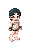
biggrin I really love your character design! It seems so bright, fresh, and fun.

What I think is wrong with your coloring is that you are using straight, completely unsaturated purples for your shading. Because purple is the darkest color on the color wheel, and you have it directly next to an unsaturated tannish color, the colors are clashing and competing for attention. I take it that you already know your complimentary color sets... There is some yellow in the tan, and that yellow is what is causing it to clash with the purple.

To remedy this, I would suggest to tone down on the purple. While it's a fine color to have in there (it's wonderful for dramatic lighting biggrin ), I think that it's the amount of it that's making the coloring look bad. Now, that is not to say that you should take it away. I think that the best way to reduce the purple would be to blend your colors.

Right now, it looks like you're using three basic tones: the pinkish highlights, the tan skin, and the purple. I think that adding more tan tones and blending your colors together would make it look more realistic. For instance:

Here I've got your base color. I've addressed where the lights and shadows are ('cause that's what I always do at this point X{P).
User Image

In this stage, I've picked my highlight and shadow for the tan. I didn't use different shades of the same color, but I used ones that were very close to the tan. The highlight has more yellow in it, and the shadow has more red-- but only a bit. I've got both new colors on the palette on the side.
User Image

Now, I've added in your highlight and shadow from the original picture.
User Image

Now, this is where the blending begins. Everyone has their own way of doing it, but this is how I do it. It's kinda cheap, but it's quick and easy and works in most programs. There are a lot of ways that look better.
User Image
You notice how there is a (somewhat) smooth transition from pink, to yellow, to tan, to brown, to purple? In this stage, I selected the color I wanted more of (in this case, the tan, because the purples and pinks were overpowering it), set my brush to 25% opacity, and went over the area I wanted less of in a single, very wide stroke. Then I would lessen the size of my brush as I moved closer to to the original color.

So, say, with the yellow, I made one broad stroke that was able to cover the edge of the pink and where the yellow meets the tan. Then, I made my brush slightly smaller, and went over the middle of the where I had just layed down the first stroke. I repeated this until there was a smooth transition.

One thing I've noticed while using this method of blending is that light colors require less transparency to overpower a color, while dark colors take a higher transparency to achieve the same effect. When I tried to go over the purple, my original brown shade was no match for it, so I had to introduce a slightly redder brown (shown as the top color on the tan palette in the fourth picture) at a 45% opacity to blend effectively.

I chose adding red to the shadows because red is closer to the deep purple that you chose for your shadows. In this case, deep purple was the most powerful color on your palette, so you needed colors that transitioned from brown to purple so that it wouldn't be so close to the yellow. The reason I could use a yellow-tan for the highlights is because the pink color that you chose was already very saturated with white, so the relatively unsaturated yellow did not need as much effort to overpower it.

I hope I'm making sense, I really tried my best. xd sweatdrop

Ishrie


Call Me Stephanie

PostPosted: Wed Oct 03, 2007 6:41 pm


Yay! Thank you so much!

I think I understand and will definently try next time. I think I'm going to ditch the faerie... I didn't really want to take it the whole way anyway, it was just a study. Thanks for the help on it though. ^_^

You're so totally awesome *squeeee!*
PostPosted: Thu Oct 04, 2007 8:59 am


User Image

That's what I'm working on now... since the stupid forum is messed up again!

Note: I already fixed the left (our left) shoulder... and I know the hands aren't great, I just did them quick. Also, I adjusted the eyebrows (I want her to look angry).

Call Me Stephanie


Call Me Stephanie

PostPosted: Sat Oct 06, 2007 3:28 am


updated first page. ^_^
PostPosted: Sat Oct 06, 2007 8:08 pm


UPDATED! *Finally, wouldn't let me post!*

Call Me Stephanie


Call Me Stephanie

PostPosted: Sun Oct 07, 2007 6:02 pm


Updated! ^_^
PostPosted: Mon Oct 08, 2007 11:46 am


Updated! I think I'm close to being done with the sketch!

Call Me Stephanie


KotokoPlum

PostPosted: Tue Oct 09, 2007 7:51 pm


Eek, if I found this sooner I would've drawnover your sketch. Would you still like one?

Generally, there are several somewhat severe anatomy problems, but I don't feel it would interefere too drastically with the details...

((I'm quite busy this time of year, but I'll definitely make one for you if I can find some time... and if you want one. xD))
PostPosted: Tue Oct 09, 2007 9:42 pm


I already finished it... but if you'd like to you can.

I wasn't aware there were TERRIBLE errors in the anatomy *Cries*

Call Me Stephanie


KotokoPlum

PostPosted: Wed Oct 10, 2007 1:34 pm


Well, they weren't TERRIBLE! D;

They weren't super tiny nitpicky, but it's okay. >___< I'm sorries! Basically, the hips were too narrow and the stomach arched inwards too much. The hands are also sorta off, but they take time.

Your finished work looks good; though the contrast needs to be greater. The highlights and shadows don't stand out and that makes the picture lack depth.

I really like the eyes and the hair, though. C:
PostPosted: Wed Oct 10, 2007 8:37 pm


User Image

I like that you went for something more dynamic. What I would recommend is to always keep your line of action(gesture) in mind. The one here is just her center line. I tried to keep the same turn of the chest you had. I like that a lot. However, I think it's very weak in the hips. Keep in mind, there's a pelvic bone there. The hips are a big part of the gesture. (It helps to keep reference of the body on hand to glance at. It doesn't have to be a pose that's even similar sometimes. A chart or just a good shot of someone standing helps to just see the general shapes.

The pose was very wooden though. A lot of dynamics in pose comes from stretching some parts and bending others. They also work in opposition. Here, I lifted the chest a little to give some more power to the pose. Also, try using cylinders to see which direction the parts of the body are going. That helps you see what is going back and what is coming forward and fix foreshortening accordingly.

Even slim and fit women are meaty in the hips. That's what makes woman sexy. Something to grab onto and slam against. Alright. TMI, but you feel me. I got the sense that you were doing that, but because the pelvis isn't well formed, it got a little lost. You're going the right way on a lot of things.

The other thing that bothered me was her lack of facial expression. What kind of expression should she have? Expressionless is boring and a bit offputting. (But not in a good creepy way.)

Errol McGillivray
Captain


Call Me Stephanie

PostPosted: Thu Oct 11, 2007 9:03 am


I REALLY like that draw over. I wish I saw a pose like that before... the one I used was pretty wooden... that's my fault.

I'll keep those things in mind next drawing. ^_^
PostPosted: Thu Oct 11, 2007 10:33 am


Anytime. How old are you, by the way? I have something that can help you, but you've got to be 18.

Errol McGillivray
Captain


Call Me Stephanie

PostPosted: Fri Oct 12, 2007 4:34 am


I'm almost 20. ^_^
Reply
Sketchbooks [Get crits here! Open to everyone]

Goto Page: [] [<] 1 2 3 ... 4 5 6 7 [>] [»|]
 
Manage Your Items
Other Stuff
Get GCash
Offers
Get Items
More Items
Where Everyone Hangs Out
Other Community Areas
Virtual Spaces
Fun Stuff
Gaia's Games
Mini-Games
Play with GCash
Play with Platinum