|
|
|
|
|
|
|

Errol McGillivray Captain
|
 Posted: Wed Feb 17, 2010 9:24 am Posted: Wed Feb 17, 2010 9:24 am
|
|
|
|
|
|
|
|
|
|
|
Posted: Fri Feb 19, 2010 1:34 am
|
|
|
|
|
|
|
|
|
|
|
|
|
|
|
|
|
|
|
|
|
|
Posted: Wed Mar 17, 2010 8:02 pm
 |
|
|
|
LimnHere Sorry about that! 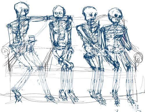 Crit: Crit: I find that the jock and the friend have a similar pose as does Sally and Poindexter so I'm not too sure if it came across. When I drew Poindexter, I didn't have the girl next to him so I feel like now having him look down at his watch, made it seem like he was trying to get away from her, rather then him trying to see where his friend is. I think my proportions are off, and even among themselves so I think that is something I need to work on. Ref: I hope I was allowed to ref, because I briefly looked at my skeleton because I wasn't sure about one of the bones. I didn't pose it or anything through.
For the friend, I would lean her towards him more, keeping her hips where they are. While a man may keep a small distance, while still closing in, women don't have the societal taboo of crowding a man. Women that throw themselves at a man literally do that. (Which is where the term probably comes from.) You can lean her in, slinking on him.) Poindexter is a bit rigid and worried about time rather than where his roomate is. I think it works, but would be stronger if he were physically looking around the room.
Great job on this part. |
 |
|
|
|
|
|
|
|
|
|
Errol McGillivray Captain
|
|
|
|
|
|
|
|
|
|
Errol McGillivray Captain
|
Posted: Wed Mar 17, 2010 8:13 pm
|
|
|
 |
LimnHere Here is the second part of it. I hope you didn't mind that I did this part on the computer as well. I didn't use the undo tool, just brush and eraser. I don't think I use the undo tool a lot so it wasn't too bad. 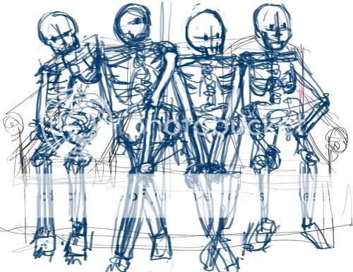 Crit: Crit: I felt like they were a bit small in the last picture but this time I feel like I may have made them a bit too big. I like Sally, the friend the the nerd but I'm not too sure about the jock's pose. I don't feel like hes scared of getting rejected. I tried to keep in mind that they were all part of one drawing so I think proportions compared to each other is a bit better. Questions: I'm a bit confused about how to answer the first question, "image" in what sense? As for how it affected the story, I felt the story was a lot more harsher in what was going on, as in, this one the guy is worried about being rejected and the best friend is shy and just looking where as before, they were both confident or willing to go for it. I did keep them in the same spot because I still felt like the guys should be out on the side, purely because one is looking for their friend and the other is afraid of being rejection but I don't think it was forced. I oddly found it easier to draw this one, then the first one. Maybe because it was like "try two." Thanks for the exercise! It was fun! 3nodding
I can see from the direction of the jock's legs that he's taking the plunge and talking, but he's unsure of himself. He's not turning his crotch towards her with speaks a lot of being ready flee at the first sign of danger. Very very good on that one.
Sally looks like your classic, too good for the room b***h. Nose in the air, keeping her head above everyone and confidence and poise in her spine. The one thing I'd change is how her legs are crossed. She's not interested. Cross the knee away from him. That is protecting the crotch, which people do when they are put off by someone. I like that her arm that is away from him is framing her torso, like she's showing off the goods, but saying "you can't have this." Excellent.
Her friend is hesitant, but still showing great interest and still going after the guy. It works, but there is little sense of personality here. The acting is far better with Sally.
Poindexter lacks personality too. I can see he's relaxed, but he's not taking up enough space to say "confidence". He's neutral, which is good, but like the last, he's not actively looking for his roomate.
You did a great job with these. This exercise is very good in seeing how important it is to have your illustrations act out the story. If your characters are acting out the story so that each thing they are doing and feeling is clear, you are much more likely to have successful character illustrations each time. |
|
|
|
|
|
|
|
|
|
|
|
|
|
|
|
|
|
|
|
|
Posted: Wed Mar 17, 2010 8:50 pm
|
|
|
|
MF King This is not finished but i just really wanted some feedback on the basketball player at the top Air

You've got a strong idea going, but the execution looks a bit half assed. Get used to keeping your outlines firm and clean. Your silhouette is what tells people what's going on. Especially in and image that is mostly silhouette. The lack of a clean, graphic outline here looks lazy. It might help to have a compass, protractor, or a french curve to help you guide your line to be a curve and not wobble.
The red lines are a breakdown of the symmetry of the piece. First, you have a rectangle, with two triangles on the sides. If you make a cross across the center of the rectangle from all sides, you'll find the dead center. Using this, I made diagonals from the far corners of the triangles to find the center of the bottom line. Knowing where your midpoints are help a lot to keep things even on both sides.
I think it's a good idea to start with symmetry and offset to create attractive asymmetry. (1) I used the lines as a guide to make the radiating buildings. (1) I used parallel lines from the buildings to keep the basketball rim and backboard lined up so that it follows the radiating buildings. (2)
For your guy, just remember that when you draw a figure doing something, draw it again and push the action. Exaggeration is the key to getting the point across and keeping things dramatic and exciting. Here, I chose the extreme start of pushing the ball towards the hoop. This creates tension, which make it feel like the force that is about to come is greater. To emphasize the force, I've arched his body more. Exaggerating the anticipation moment before an action gives more drama and gives people a sense of having more time to expect and predict what is happening next.
When doing very graphic work, you want clean, bold shapes. Otherwise, things seem a bit wishy washy and lose a lot of the impact you're going for. A good way to keep things looking bold and graphic are to keep things consistent. And example is the heights of the buildings and features of the landscape. Make lines across your image and have multiple things cross the image share these guidelines. People will have more of a sense of pattern and the composition will seem more harmonious.
Overall, this is a pretty good image. I like it. Just try to be a bit more clean and confident in your execution. |
|
|
|
|
|
|
|
|
|
|
Errol McGillivray Captain
|
|
|
|
|
|
|
|
|
|
|
|
Posted: Thu Mar 18, 2010 2:29 pm
|
|
|
|
|
|
|
|
|
|
|
|
|
|
|
|
|
|
|
|
|
|
Posted: Sat Mar 20, 2010 6:53 pm
|
|
|
|
|
|
|
|
|
|
|
Posted: Sat Mar 20, 2010 7:09 pm
|
Errol McGillivray Captain
|
|
|
|
|
|
|
|
|
|
|
|
Posted: Mon Mar 22, 2010 11:45 pm
|
|
|
|
|
|
|
|
|
|
|
Posted: Tue Mar 23, 2010 6:18 pm
|
|
|
|
I'm not taking dedicated mentees right now, since I am dedicating Mondays to gaia for a while. (If you read my first post, I explain why.)
Please, still post here and ask for feedback. Just please understand that I may only be able to interact on Mondays.
(I'm supposed to be doing homework right now, but I had to send the announcement for the guild contest. haha.)
Crit stuff:
I think the couch you did with more space between the people worked a lot better. You gave them room so their gestures and silhouettes were very clear. One can fill in everything in black and still see what's going on. (The people, not the couch.)
In the second, making him take up more space shows calm and confidence. Also, the act of looking around, helps. Lifting his head a little can indicate that he's looking farther and thus across the room. Turning the shoulder to follow the neck a bit can help get the point across that he's searching around. I like to act things out and see what feels right and then draw it, exaggerating it it a bit.
Seriously though, you did a great job. I'm going to try to have the next activity ready for Monday. Feel free to shoot me a PM on Sunday to remind me. Haha. It takes more than one sitting to set these things up.
|
|
|
|
|
|
|
|
|
|
|
Errol McGillivray Captain
|
|
|
|
|
|
|
|
|
|
|
|
Posted: Wed Mar 24, 2010 11:32 am
|
|
|
|
|
|
|
|
|
|
|
|
|
|
|
|
|
|
|
|
|
|
|