|
|
|
|
|
|
|
|
|
 Posted: Mon Mar 26, 2007 8:47 am Posted: Mon Mar 26, 2007 8:47 am
 |
|
|
 |
Hey, everyone. I'll make this pretty later.
I'd like to learn to draw in the Western style, although I'm sure this doesn't show very well at the moment. I've had a DA account in the past, but I couldn't get feedback on anything at all. I really am open to critique on pretty much anything, as long as it's specific and helpful. There's a lot of stuff that's "off" and I can see it, but I'm not sure how to fix it.
Preferred Mediums: Pencil, Colored Pencil
Current Strengths:
- Mari says I do good inanimate objects and symbols <3
Current Growing Edges:
- I'm trying very hard to pick up on proportions.
- I ink with a ballpoint pen, and it shows. It sucks.
- I overthink drawings, constantly changing every tiny little aspect. The only feedback I consistantly get is "you need to sketch more".
Anyway, critique of anything I've done lately is more than welcome, and I'll post new stuff as I draw it. My image account is http://www.imageevent.com/zionchild/zionart
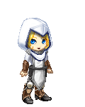
Latest Stuff: (the below are already completed and inked, I can't change them xP )  This was my first shot at using Photoshop. I decided to put off learning to color until I have sketches and lineart a little better. An OC of mine. He turned out looking a little more aggressive than I meant for him to.
|
|
|
|
|
|
 |
|
|
|
|
|
|
|
|
|
|
|
|
|
|
Posted: Mon Mar 26, 2007 10:32 am
|
|
|
|
|
|
|
|
|
|
|
|
|
Posted: Mon Mar 26, 2007 10:48 am
|
|
|
|
Hey Zion, glad to see you post your wip post, your art's not bad at all. =D
I can definitely see that you're trying to cross from 'anime' styled stuff to more western styles. Like in your picture of the guy posted here, that's definitely not an 'anime' type nose. The only thing I'd say as far as westernized faces go, it needs more detail for the eyes and mouth. He's got no eyelids and no hint of lashes and the eyes are still a bit too large. The face itself, still looks like a cross between anime styles and western, leaning closer towards anime.
I saw that you said you ink with a ballpoint pen, but I really don't see anything wrong (unless neither of these pics was lined that way). Maybe you mean because of a little smudginess. To avoid that, you might want to get some no smudge type pens, like Micron or Sakura brand. I think the latter is more expensive, which is why, when I do actual art on paper, I use Microns. That also might help if you want finer lines considering that ballpoints don't usuall come in very tiny sizes. I'm not saying you need finer line, but only if you want them.
In regards to proportions, since you want to do westernized type work (which I'm assuming is not the same as realism), you may want to pick up a book called 'Drawing the Marvel Way'. At least, I think that's the title. Even if you're not a fan of Marvel, it's a good book because it does actually have a lot of info in regards to proportion, like how many heads high people are (theirs are typically about eight, if I'm not mistaken) and how many heads long limbs should be all in relation to the size of the character's head. I have this book and it was a really big help when I was trying to learn proportions. It also has a section on faces, head shape and structure, and the like, and because it's kind of old, like from the eighties, they're style is very westernized. Not the stuff they did a few years back when they kinda went into an anime style. I doubt though that you'll need the book very long because your proportions aren't horrible. Just a little too long at the moment. Mine, when I found that book... well, we'll not discuss that as it's exceedingly embarassing and nowhere near your skill level. =P
And there's nothing wrong with overthinking drawings sometimes. I do it still and I think it's a help. You don't catch your own mistakes if you don't do it. Even if you don't catch every single mistake, it's still a hlep.
As far as your strengths go, your inanimate objects and your symbols are really quite good. They're very neat and clean and amazingly straight. I have no skill with that and I'm envious. ><
Now about your posted pics....
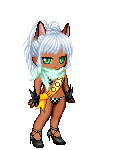
They're not terrible, far from it, but like you said, there are a few things that are 'off'. In the first picture, the wolf or fox woman, her arms aren't the same length. More specifically, her forearms aren't the same length. The one in the foreground is much longer than the one lighting the candle. Both forearms could use some alteration: the one in the foreground shortened a bit, and the one with the candle lengthened. Also, her wrists are far too delicate for a woman of her bone structure. I know you may want to stick with that, but even if her gloves and arm wrappings are like a second skin, her wrists need to be a bit thicker.
On the second picture, it's about the same, one arm looks longer than the other. Also, his body is kind of non-descript, it makes me think of the way they used to draw the Gundam guys back in the eighties or so. No muscle structure or anything. I only comment on that because I don't think westernized stuff is depicted like that, especially in a form fitting body suit. His hands may also be too small.
Fweh~! Long winded post, sorry about that, I wanted to address everything that I could. But yeah, you're not doing terribly, quite the opposite. It's just minor fixes and such. ^_^
|
|
|
|
|
|
|
|
|
|
|
|
|
|
|
|
|
|
|
|
|
Posted: Mon Mar 26, 2007 11:42 am
|
|
|
|
@eejbeej: You're absolutely right, I've been trying to learn from other folks' drawings and a couple of "Learn to Draw"-type books. I'll give some real-life a shot, I have to pick up a sketchbook this week anyway. :3
I'll go back to drawing "nude" - I'd been trying to move away from that since it seems like I erase so much of it when I put stuff on top of it, but I see what you're saying about keeping the anatomy right.
@Mari: No, THANK YOU for the in-depth criticism! You have no idea how this entire time I've been getting "yup, looks good Zion, keep trying! Sketch more!" So it's good to get something more substantial. As for style, yeah, I'd like to learn to do something between the art you see in current Marvel/Image comics and the animation-esque style pach_work has going on. It's not realism, but it's probably closer than most of the anime I've seen.
The fox-girl was actually my first attempt at doing something in Photoshop. I sketched her out, scanned it, traced over the sketch lines in PS, and colored. It took a lot longer than I thought. I wish there was a way to just convert scanned pencil lines directly into lineart. I noticed that her upstage (candle) forearm was short after I'd drawn it - I meant to try and make it foreshortened, like it was bending away from the camera, but I fail at shading and didn't change the length afterward. I completely didn't notice the wrists, I'll have to pay attention to that for next time.
In the second picture, you can see the ballpoint-inking problem. It doesn't look cruddy, but there's no variation in line width, and I'm starting to realize how important that is. I really thought the arms were the same size, but I guess the one on his bedroll is shorter after all. ^^;; I tried drawing muscles on him, but he ended up looking really buff/lumpy and I wanted him to be more of a lithe figure. I'm going to look for that book you mentioned, perhaps they'll have some tips on non-bulky muscles.
You're completely right about his eyes - they were made following a tutorial, but they just don't fit. I think the hands are right, they're about the size of his face...? Maybe hands are bigger in drawings.
Thank you both for the positive criticism AND the encouragement. <3
|
 |
|
|
|
|
|
|
|
|
|
|
|
|
|
|
|
|
|
|
|
|
|
|
|
|
|
|
|
|
|
|
Posted: Wed Apr 11, 2007 9:53 pm
|
|
|
|
|
|
|
|
|
|
|
|
|
Posted: Thu Apr 12, 2007 9:42 am
|
|
|
|
|
|
|
|
|
|
|
|
|