|
|
|
|
|
|
|
|
|
 Posted: Wed Nov 17, 2010 4:04 pm Posted: Wed Nov 17, 2010 4:04 pm
|
|
|
|
|
|
|
|
|
|
|
|
|
|
|
|
|
|
|
|
|
|
Posted: Fri Nov 19, 2010 2:51 am
|
|
|
|
|
|
|
|
|
|
|
|
|
|
|
|
|
|
|
|
|
|
Posted: Fri Nov 19, 2010 1:45 pm
 |
|
|
 |
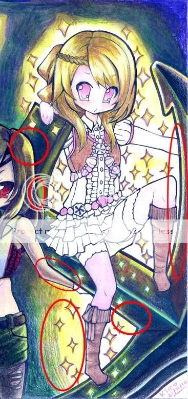
 Ok, now it stands much better. Your figure had an odd balance, so I tweaked it a little to give her more stability. Ok, now it stands much better. Your figure had an odd balance, so I tweaked it a little to give her more stability.
You had a few issues, right to tell me your lower portion was awkward. Remember to keep the weight of the character balanced, and you will done fine, as many issues that the pic had were originated by this.
When you draw legs (of a standing figure), you need to keep to yourself that they are the parts of the body that actually support all of you, they don't twist or bend in strange directions because they are under stress. They may look twisted but that's just because the perspective is playing with your mind.
The proportions in the image could use some retouching, too, but that's not the point.
- - - -
When uploading stuff to DA/photobucket/imgshare/uknow, specially with the sketches, try not to upload the larger/most detailed version of it. Something around 1000x2000 pixeles should be enough. Why? Because it's more viewer-friendly, user-friendly and host-friendly.
Also, when submitting anything to get advanced feedback, try to sumbit the pic the cleanest you can. Clean is neat, it says that you are dedicated and care for your work.
Hope this helps. |
|
|
|
|
|
 |
|
|
|
|
|
|
|
|
|
|
|
|
|
|
Posted: Fri Nov 19, 2010 3:41 pm
|
|
|
|
|
|
|
|
|
|
|
|
|
|
|
|
|
|
|
|
|
|
Posted: Fri Nov 19, 2010 7:53 pm
|
|
|
|
Mizuki-chan601 About the linking, I am a noob to DA. I did not see a share link, Thank you for pointing that out sweatdrop For the smudges, this is just a sketch and not completed. I was using vine charcoal which can be very messy, but I'll clean it up better next time. Thank you so much for doing the redlines, that helps me out a lot! Thank you so much for your help and feedback! heart
Anytime.
Don't worry, I may seem harsh but I am here to help. I've been a lot more of years than my DA points in the site, so I can help with it as well.
And if I told you about the sketch, it was just to make my life easier, not yours razz , I don't wanna go around checking and redlining a lot of dirty, stuffy sketches.
- - - -
@Diabolica:
There's a reason why colored coffee paper art is not popular. It's because it's really hard to do. Colored pencils tend to get "undertoned", like they were a layer below the sepia.
If you really want to walk that road, go ahead, try it and refine your technique that way. If I were you, I wouldn't try coloring it, but inking/painting it. With inks you'll have more solidity to work on. I have a friend who used to colorize its coffee paper work with watercolor pencils, he managed to achieve an ethereal old look that really worked for him. Maybe I can convince him to give me some tips and pointers so I can help you better.
And about the colors, well, I don't use it anymore, but you can do pretty awesome pictures these days with them. I would go with Prismacolor, but the little things simply hate me, so I used to work with Staedtler and Derwent ones (St's are great but there are not too much variety here, and Derwent is not that good but I could find them easier than St's).
Good luck. |
 |
|
|
|
|
|
|
|
|
|
|
|
|
|
|
|
|
|
|
|
|
|
Posted: Mon Nov 22, 2010 10:55 am
|
|
|
|
Andra, I'm so happy to find an active mentoring thread here! (: Most others are
kind of dormant. Your work shows an knowledge and understanding of an
aspect of my art that I really struggle with as well; I just know that you'll be
able to help me (:
I struggle with lighting. Any type of lighting, such as day light, shadows from
objects in the background, moonlit, darkness, etc. It also pairs with my struggle with backgrounds. As I think of background, a type of lighting comes
into mind, too. I am guilty of making 99.5% of my work brightly illuminated
anime/manga girls suspended in a white background or a decorated
background so that I wouldn't have to worry about lighting XD
But when I see your work, your backgrounds and people seem immersed
in the same environment and lighting and it creates quite a cohesive and
harmonious overall effect, and I want to strive to accomplish such a
milestone in my own work, although my style is extremely different, but
I feel that I will benefit from your generosity and help nonetheless. :d
You can also point out other things unrelated to you when you see them
sticking out at you.
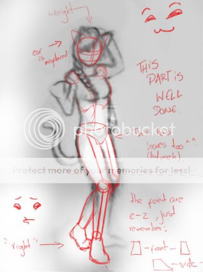
Andra, this is the last piece that I have done... LOOOOL XDDDDDD
http://yellowpencil.deviantart.com/art/My-Little-Anchor-185889446?q=&qo=
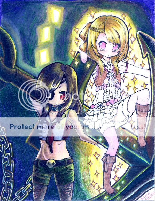
IDK IT JUST EMBARRASSES ME XDDDDD
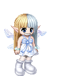
The girl on the left is Gana; the girl on the right is Yulo.
Gana is a zombie I guess (: So her skin doesn't have any reddish
pigments in it; she's quite cold. And Yulo is a gippy hipsie, who
I intended to make glow only faintly. It turned out, she is the only
light source in the entire picture. My original intention was to make
the entire picture dark, but then I established Yulo as a light source.
I ended up coloring everything else as if she were a very strong
light source. Also, I got confused about which parts of certain objects
were supposed to be illuminated by her because of where she puts
her arms and legs and such and if it would affect her clothes. So yeah
the whole thing is a mess. XDDDDDDDDDDD
This piece is pretty much done already, but if you could give me
pointers and stuff, with some helpful diagrams to lead me in the right
direction, that would be great (: for my next piece in mind! Which will
have a moonlit setting, like I originally intended for the one I just showed
you until it took an unexpected turn for the worst XD
So if you could help me out, that would be great. (: And you don't
have to send me one long post reply. Just cut it up into several small
posts I guess, or keep editing/expanding the same post until it is
complete, because I know you are probably very busy with your own
amazing work! Thank you for your time, Andra! (: heart heart whee
|
|
|
|
|
|
|
|
|
|
|
|
|
|
|
|
|
|
|
|
|
Posted: Tue Nov 23, 2010 10:37 am
|
|
|
|
@Yulo/Yellow:
Nice work in you dA.
I'll keep expanding on this subject because it's really large.
Light:
There are multiple types of light. However, they can be englobed in one of three cases for simplicity's sake, based on where's the light source:
- Outside the Character: The usual. Something else besides the characters depicted in your art is the main source of light. Sometimes it's implicit, other times the artists depict it. The 90% of the pictures out there use this kind of light. It sub-divides in a lot of stuff, so here I'll let sleeping dragons lie and won't explain anything else (until someone else's asks gonk )
- By the Character: The subject of your work is doing something (magic, tech, whatever floats your boat) that is illuminating the area and serves as the main source of light for the artwork. My recent works try to explore that kind of light. It's a deep theme, and it's also the one you tried to use in the Yulo/Gana pic. Before proceeding, let me add the last type of light you'll find in the pics...
- Inside the Character: Yeah. It's freaking hard to do a pic of this nature, as far as I know there are very few references of this kind of light, and I am not sure if I want to see them xd . But it's there.
- - - - EDIT - - - -
edited November 24, 2010
External Light Source
The basic for character art. Something else outside the character is illuminating the area where the character stands. Sometimes you can't see the light source (therefore abbreviated as LS) at all...

... and other times you can...
[insert image here XD - coming soon]
... but it's always there.
The first thing you need to do after you decide to use this type of light is stablish the location of the LS, wherever it may be. Basically, you'll want to place it somewhere in front of the subject to make your life (and the viewer's life too) easier. When doing character art with no background at all you'll go with this every time, and usually you won't need to depict the LS with it. So don't be surprised if you have only used this kind of light and none other in your whole career if the only thing you do is character art.
Oppositely, if your LS is located behind the character, well, usually you'll have to do some kind of background just to explain the lightning peculiarities of your pic, sometimes ditching completely any kind of details on the character and simply going with the silhouette:
(I'll keep expanding this one).
|
|
|
|
|
|
|
|
|
|
|
|
|
|
|
|
|
|
|
|
|
|
|
Posted: Tue Nov 23, 2010 7:25 pm
|
|
|
|
|
|
|
|
|
|
|
Posted: Wed Nov 24, 2010 2:39 am
|
|
|
|
@Yulo:
Oh God I was trying to sneak past the whole Light theme xd ... Well, first lemme finish the analysis of your pic and then we can move on to shed some light upon the Light subject (pun slightly intended, so make sure you laugh because I am the one teaching after all XD).
Analysis:
Well, you are kinda wrong when you tell that the pic is a mess. It can be easily fixed as long as you keep in mind these points:
- A large body or object emitting light is treated as multiple light sources in any kind of picture. Any other body in the same pic should be treated as having multiple light upon itself. When this happens, if you can count the number of light sources with the fingers of your left hand, then your right hand will be very busy creating layers of light one after the other. When you can't count them (or when there are multiple light point sources like in you pic) then you will have an easier time. Why?
Because light coming from such a source(s) tends to be blurry. Seriously.
Check:
See the torso of the guy. He's practically holding the light source in his hands. His upper body is illuminated by a single light source, yet it is large enough to qualify as multiple ones. That's how light should be in your pic, and you kinda achieved that in various degrees, many of them successful.
Of much more relevance to us is the way that shadows are cast upon the subject, because light tends to overlap and blur itself without making the whole area more bright, just more illuminated. The shadows, in the other hand, are more deep, thus creating areas darker than they should be should the light were "simpler".
So...
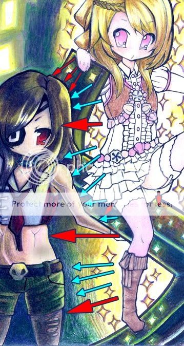
Here you have the main light patterns as you suggested by making Yulo glow. The red arrows are the main light sources, determined by the size of the body that is emitting it and by the distance from the emitting body. The larger the arrow, the lower the value of the light.
(I'll keep editing this one...)
|
|
|
|
|
|
|
|
|
|
|
|
|
|
|
|
|
|
|
|
|
|
|
Posted: Wed Nov 24, 2010 3:21 am
|
|
|
|
|
|
|
|
|
|
|
Posted: Wed Nov 24, 2010 12:14 pm
|
|
|
|
Andralexis @Yulo: Oh God I was trying to sneak past the whole Light theme xd ... Well, first lemme finish the analysis of your pic and then we can move on to shed some light upon the Light subject (pun slightly intended, so make sure you laugh because I am the one teaching after all XD).
LOOOL wtf XDDDD That is such a redundant pun XD
and okie whee
Quote: Analysis: Well, you are kinda wrong when you tell that the pic is a mess. It can be easily fixed as long as you keep in mind these points: - A large body or object emitting light is treated as multiple light sources in any kind of picture. Any other body in the same pic should be treated as having multiple light upon itself. When this happens, if you can count the number of light sources with the fingers of your left hand, then your right hand will be very busy creating layers of light one after the other. When you can't count them (or when there are multiple light point sources like in you pic) then you will have an easier time. Why? Because light coming from such a source(s) tends to be blurry. Seriously.
Okay, that's a lot to take in, actually .... My mind is a mess XD
And I'm left-handed hahaha it's very impressive that you're right-handed and your right brain is so developed! whee
So... I can't count the light sources in my pic. How does that give me an easier time? XD What do you mean by blurry light?
Quote: Check: See the torso of the guy. He's practically holding the light source in his hands. His upper body is illuminated by a single light source, yet it is large enough to qualify as multiple ones. That's how light should be in your pic, and you kinda achieved that in various degrees, many of them successful.
From looking at the picture of the guy, and your explanation...
you're saying that my picture also has a large amount of
illumination in some areas that count as being illuminated by
multiple light sources, because the light source, Yulo, is big
enough to count as multiple light sources!
Quote: Of much more relevance to us is the way that shadows are cast upon the subject, because light tends to overlap and blur itself without making the whole area more bright, just more illuminated. The shadows, in the other hand, are more deep, thus creating areas darker than they should be should the light were "simpler".
So what you are saying is, the area of illumination becomes bigger as more light from multiple light sources overlap and blur(what do you mean by blur?) each other, causing the shadows to become smaller, yet darker in value. Then, the reflected light would be more luminous, right? Which leaves even less room for shadow!
And by "simpler" light, you mean a single, non-blurred and non-overlapping light source.
What, then, would cause the area of illumination to become brighter?
And how would a brighter light source affect the shadows?
Quote: So... Here you have the main light patterns as you suggested by making Yulo glow. The red arrows are the main light sources, determined by the size of the body that is emitting it and by the distance from the emitting body. The larger the arrow, the lower the value of the light. (I'll keep editing this one...)
It's interesting to see all these neat arrows on my pic XD
Larger arrows indicate a farther distance from the light source, which would
cause the area of illumination to become duller.
Smaller arrows indicate a shorter distance from the light source, which
would cause the area of illumination to become brighter.
The color coding, however, confuses me. ): Red arrows are the main light
sources... how did you identify the main light sources in my picture? ):
Thank you so much, Andra! Your posts are very informative and helpful;
I'm slowly grasping lighting theory in my mind XD Although I keep asking
questions. I'm anticipating your next expansion/post. whee |
|
|
|
|
|
|
|
|
|
|
|
|
|
|
|
|
|
|
|
|
|
|
Posted: Tue Nov 30, 2010 12:28 pm
|
|
|
|
^^Sorry for taking so long I was buried in work but thought a lot about this one.
Let's keep going. But before we proceed, the questions:
Blurry light? What do you mean?
Blurry light is the effect you see where you can't determine the real limit of the light produced by the source due to it's blur. Many times your eye will perceive very well the reach of the light produced, and actually defining this limit is critical to make a picture "glow". You did it in your pic defining the limit of the light in the uppermost right portion of it (around Yulo's head):
The circles are where I found certain problems, all of them related to the "blur effect" of the light.
Certainly, I don't know why it becomes blurry (as I am no physicist) but when having a large LS light tends to overlap and create areas where the color and the values have a softer definition (like they were degraded) and create a blurry look. Check specially the guy's shirt - I can see, at most, 12 well-defined shadows, and prolly there are even less -.
I can speculate why this happens. Time for some hard facts:
- Light is nothing but radiation. Key is that it radiates, it does not travel in a straight way from one point to another.
- Photons (light's "components" so to speak) are well-known to exhibit wave-like and particle-like behaviour.
So, light travels in a dual-fashion: like a wave and like a particle. When something travels like a particle from any point to another through the shortest way we have a straight line.
Wavy motion is another matter because it doesn't go from A to B, it goes everywhere. Wonder where we've seen that kind of motion...
This illustrates it very well, however, we are talking about light, not water. Everywhere means literally that, everywhere. In the drop pic we appreciate wavy motion in a 2D manner (kinda, I know, I know)...
(Getting dizzy? This is why I tried to avoid light, it's a very complicated issue. Historically the greatest minds of all time couldn't agree with light, that's why we have a load of theories about it. Good thing we are just artists and not theoretical physicists ^o^. My mind tends to be a mess and if I were to make an Theory of Everything, well...)
Overlapping light? Brighter LS's?
Perhaps this Thomas Young's diagram explains it a lot better:
When having multiple sources of light or a large single one you have to think a lot about how those interact with each other. That's where lays the secret of a successful image of that nature, in the interaction. As light from one source crosses paths with light from a different source they create larger areas without shadows. Note that this not necessarily means larger brighter areas. Why?
When painting/drawing LS's, you need to mantain the light sources bright. No other area of your whole picture should be brighter. EVER.
And while nothing is brighter than pure white (that is 255 across the RGB scale, or #ffffff in hex) I'd highly recommend to save it to really, really bright light sources. Not even the Sun is that bright unless you look directly at it. (Or so Photoshop says, try the dropper tool over any googled sun pic, I assure you that you'll find a minimal quantity of pure white pixels unless the pic was, well, Photoshop'ed xd ).
And that too is a teaching by itself. Great photo artists (I refuse to call them photographers for many reasons I won't explain right now) know that they must keep under their control the contrast of the pic, so they employ a lot of times a technique where, in order to make light brighter they make shadows darker. Increases the contrast. Sometimes they make the whole pic darker but the light source they want to make brighter.
Identifying Light Sources (LS's)
Hope everything else made sense, because here it's where it will get dirty. And wet. And violent.
Internal LS's (that is, light sources inside the pic) tend to be rather obvious in art (if you can't see it glow then it's not a light source). Trouble arises when the LS is big enough that counts itself like multiple ones, and it's even more troublesome when the light source has a complex shape (like a human body).
But there are a few rules (albeit a thumb ones) that can be helpful:
- When making a character glow, the larger light sources should be the ones where you want the viewer's attention, aka the head, the eyes, the hands (specially in males) and the chest (specially in females). Add others to your artistic discretion.
- The closer to the point of view, the brighter. I. e. if the character is stretching his/her hand towards the viewer, the brighter it should be.
(editing...)
|
|
|
|
|
|
|
|
|
|
|
|
|
|
|
|
|
|
|
|
|
|
|