Welcome to Gaia! ::

Gaian Art Mentors

Back to Guilds

Where artists are paired in a mentor/mentee fashion to share their knowledge. 

Tags: artists, mentor, mentee, learning, drawing 

Reply Sketchbooks [Get crits here! Open to everyone]
Zath Needs YOU (new pic 08/24) Goto Page: 1 2 [>] [»|]

Quick Reply

Enter both words below, separated by a space:

Can't read the text? Click here

Submit

zathraya

PostPosted: Fri Jun 04, 2010 4:24 pm
Hello there! I'm zathraya, as you probably already noticed. Um I really enjoy hearing others critiques on my work and I hope I have a little more luck here than on the PP.

Okay a little about me, I'm in college and I have a Psychology major (originally a fine arts major). And even though I have that I'm so deeply in love with doing art.

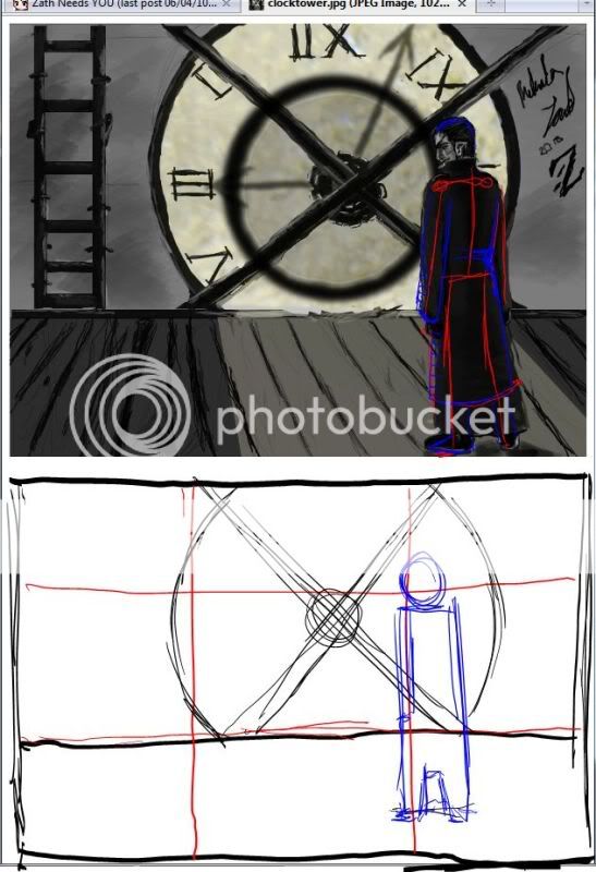
With all the boring stuff out of the way I'm looking for someone to critique this painting. It's pretty wide so I didn't post the image. It's really my first try to really work on the background, so I was hoping for some comments on that as well as the guy.


If you want to check out more of my stuff DA here

Thank you in advance and I'll look forward to your critiques  
PostPosted: Sat Jun 05, 2010 6:10 am
Hey there, good job trying to create a background. They can be pretty hard. I'll try to give you a short critique later when I'm not too horribly busy. Mostly what I can see from your work is that you need to work on perspective. ^^ If you fix that, that should greatly help with the overall feel of the piece.  

Syrella
Crew

7,900 Points
  • Mark Twain 100
  • Megathread 100
  • Friendly 100

Vena

5,300 Points
  • Hygienic 200
  • Gaian 50
  • Treasure Hunter 100
PostPosted: Sat Jun 05, 2010 12:55 pm
User Image

I think this image looks great so far in terms of atmosphere but it could benefit from some better composition. Since the guy is the focus of the image, I think it would be better if the cross bar from the clock doesn't layer right under his head, maybe just space a bit away from him. You would get some interesting negative space there too since you will have the light of the clock to silhouette his face and head. Right now his head is in a good place according to the rule of thirds, a focal point. But his feet border right before the edge of the image, which in general is not very appealing composition wise (it seems like an afterthought crop) .

Other than that he could use a bit more structuring of his trenchcoat so that he doesn't seem so straight.  
PostPosted: Mon Jun 07, 2010 4:01 pm
Syrella: Thank you! I'll look forward to that!

Vena: Your right the composition isn't the best. I'll defiantly try and fix that! Also thanks for the red lines. Oh and uh do you know any tutorials on how to do fabric? or suggestions of studies or something? I'm not really sure how to make it look realistic.  

zathraya


Vena

5,300 Points
  • Hygienic 200
  • Gaian 50
  • Treasure Hunter 100
PostPosted: Mon Jun 07, 2010 5:36 pm
http://conceptart.org/forums/showthread.php?t=14739

I really like this tutorial, because it really goes into the fundamentals of how cloth bends, though it uses lighter fabrics for demonstration. so the ideas are the same but I guess it will be less exaggerated for a heavy fabric like a trench would be made of. hope that helps!  
PostPosted: Wed Jun 09, 2010 3:31 pm
Yes! xd Thanks! I forgot to go look on that site. sweatdrop  

zathraya


zathraya

PostPosted: Fri Jul 02, 2010 3:02 pm
User Image - Blocked by "Display Image" Settings. Click to show.


Critiques?  
PostPosted: Fri Aug 06, 2010 2:25 pm
User Image - Blocked by "Display Image" Settings. Click to show.

I'd really love some critiques on this!  

zathraya


lea florens

Dapper Shapeshifter

PostPosted: Sat Aug 07, 2010 2:46 am
I commend you on taking the plunge to do an action portrait. That takes guts. XD

Though it still seems somewhat static at the moment - maybe because of the lack of contrast between the moving and static objects. Think about defining the static objects a little further (man, clothing, fissure on ground) and giving more motion lines/blurring on the things moving (rocks, man's left hand). Add more flyaways to the guy's hair - though I understand this might be hard to do, given the short length - have the ground beneath him actually cave into the floor from his strike. Have his shirt absorb some of the reflected light from his power with some yellow-white highlights.

I do like the flame(?)/lightning(?) effect on the guy's hands, and the reflection on the goggles is really well done.  
PostPosted: Sun Aug 08, 2010 10:45 pm
Lea Florens
I commend you on taking the plunge to do an action portrait. That takes guts. XD

Though it still seems somewhat static at the moment - maybe because of the lack of contrast between the moving and static objects. Think about defining the static objects a little further (man, clothing, fissure on ground) and giving more motion lines/blurring on the things moving (rocks, man's left hand). Add more flyaways to the guy's hair - though I understand this might be hard to do, given the short length - have the ground beneath him actually cave into the floor from his strike. Have his shirt absorb some of the reflected light from his power with some yellow-white highlights.

I do like the flame(?)/lightning(?) effect on the guy's hands, and the reflection on the goggles is really well done.
Hmm yeah you're right it is pretty static. I'll try and fix that thank you very much! xd *takes notes* This will really help!

haha I'm not sure how to describe his powers really. I try to make it look like a mixture of elements. It's not a particular element. It's more of its own entity, so to speak. I'm glad someone likes that. biggrin  

zathraya


Sunsway

PostPosted: Mon Aug 16, 2010 1:13 am
zathraya
User Image - Blocked by "Display Image" Settings. Click to show.

I'd really love some critiques on this!


Lovely. Before you read too much into what I'm trying to say, bear in mind that I'm not much of a color person... so from this standpoint I can only offer mild suggestions that may or may not be good ones and not full-on critiques!

To my eye it looks a little washed-out and very dark (maybe my screen settings on the darkness, I dunno), so I'd add some edges to a) reflect the light from the, erm, energy? =3 and b) bring things a bit more into focus. I'd add that to the rocks (link: [x]) as well as to his clothes. Maybe not as bright as I made it though, don't want the guy to fade away. =)

I think this is kind of the opposite of what Lea said, but I'm interpreting it differently -- to me it looks like the rocks are floating (without too much motion). So I'd suggest you either define them more if they're stationery or look to Lea's comment if they're not.

Now that I think about it you probably intended for them to be moving? =D I think I'm on a Star Wars overdose with all the things floating in my head!

Anyway, looking forward to seeing more of your work.  
PostPosted: Tue Aug 24, 2010 12:20 pm
@Sunsway: I'm still alive! Okay. Thanks very much. Actually they are supposed to just be floating for the most part. I really do need to work on the lighting thanks for the picture. I'll be working on that. xd  

zathraya


zathraya

PostPosted: Tue Aug 24, 2010 1:05 pm
Fixed it up a bit! Tell me what you think!

User Image - Blocked by "Display Image" Settings. Click to show.  
Reply
Sketchbooks [Get crits here! Open to everyone]

Goto Page: 1 2 [>] [»|]
 
Manage Your Items
Other Stuff
Get GCash
Offers
Get Items
More Items
Where Everyone Hangs Out
Other Community Areas
Virtual Spaces
Fun Stuff
Gaia's Games
Mini-Games
Play with GCash
Play with Platinum