|
Lovely traditional works! smile Color pencils heart ~
There may or may not be markers used for the darker areas, it's hard to see at this resolution.
I'd be commenting on the two finished works, if that's alright with you, because of current time constraints. Don't know if I'm qualified to, so take it with a pinch of salt. ^^; Forgive me if I mention anything you already know!
Generally speaking, the dynamic poses brings it to life, the wave of the hair looks very natural. And onwards to the anatomy.....
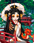
Maybe it might be me, but the wrists on both Kitkumi and Aellos looks tiny. If that's more of the style you're after, at least for the wrist that's in front, (Kitkumi's right and Aellos's...left?) it should be a teensy bit bigger than the one that's further away. Aellos's feet could be a mite bigger as well. From the way Kitkumi's face is turned, her right eye could be a smidgen closer to her nose, and a wee bit higher.
Next, coloring. One thing I love about color pencils is how it soaks up the grain and pattern of the paper you're making art on. smile Of course, the trouble about color pencils is, if the pressure isn't even enough, you can see the direction of the individual pencil lines, too...and if the lines are not all going in the same direction, it makes the art look rougher. (NB: There're some times which seeing the individual lines is a good thing, but those aren't many. Eg, for detailed hair, or if you do an *entire* picture in strokes of a single direction..) The main idea is to lay down a light layer of pigment, and slowly build up the color intensity. Some people suggest using circular strokes instead of straight left-right/up-down motions, but I think it's just whatever works for you.
In the Aellos pic, it's great that you're using complementary colors for shadows of the pokemon and bits of her attire, it'd be lovely if there's more of it, or using color as highlights. Try a dash of yellow highlight on the green jacket, or some blue shadows on the purple shirt, purple shadows with the red red hair...
The next point is..contrast contrast contrast. Deepen the shading for the areas where one cloth overlaps the next. Darken the folds in the scarf that're deeper and further from the light. For the black areas - Aellos and Kitkumi's pants, as well as other pertinent bits of upper wear - might look better with higher contrast. The hard part about shading black is that the base color is already dark enough, though this's exactly why values are all the more important. Play with greys. Leave some lighter greys for the parts that're closer to light, shade and really work the black for those that're shadowed. If the material is shiny, leave some white for highlight (or add it with white paint/Photoshop at the post-production stage)
Hope it helps!
|
 |