|
|
|
|
|
|
|
|
|
 Posted: Sun Dec 13, 2009 3:51 am Posted: Sun Dec 13, 2009 3:51 am
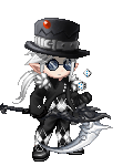
Weee, Here's a new Art work
Just made a TWEWY OC
--- hehe, me and my friend enjoy the game, so we made OCs
[ making up stories of our characters being in TWEWY :") ]
So here's the work progress and the artwork
Concept
Sketch
Line Art
Base Colors
Final :"]
:"] you can comment, suggest, make an opinion, critic, or give a reaction about my work
----------------------------------------
:"] Hope you like itA request by a friend of mine
Lifeless Winter
Well, I kinda want to know your opinions about it
suggestions, comments, perhaps red line the whole pic
=^_^=
|
 |
|
|
|
|
|
|
|
|
|
|
|
|
|
Posted: Tue Dec 15, 2009 2:05 am
Redlined! : D  And now for a critique... Firstly I love the wings and the colouring on the shirt. They are awesome and you should be really proud of yourself. Secondly kudo's for doing such a difficult pose. Many artists are shy, particularly of this kind of pose (it was hell to redline btw LOL) Don't be afraid to draw noses! Noses are beautiful things, but they do need a bit more contrast to be properly seen. I suggest a similar technique to that of the mouth. In general the colouring of the skin needs more contrast. There should be shadows under the eyebrows, on the left of his face (our left, his right), under and beside the nose and under the mouth. Don't be afraid to add curves to the jaw moving uptowards his ear. I hope this helps and keep up the good work. Youve got flair with that colouring of yours. : )
|
|
|
|
|
|
|
|
|
|
|
|
|
|
|
|
|
|
Posted: Tue Dec 15, 2009 6:59 am
Yay, thanks for the compliments, for redlining my work, for your comments and the suggestions :"]
I'd try to improve on the anatomy part, and shading, and try to enhance my coloring skills. I'll try later doing the nose and mouth as you suggested.
I'm gonna attempt on more complicated poses later, and if I have time, I'll try to redo this work of mine.
:"]
|
|
|
|
|
|
|
|
|
|
|
|
|
|
|
Posted: Wed Dec 16, 2009 3:10 am
You're welcome.
Because it's a finished piece, it would be hell to redo, but I think it's helpful to know what you could have done better. It's helpful to keep in mind for future drawings.
If you're going to do more complicated poses, make sure you throw in some simple ones in the mix. That way you can get a strong well rounded grasp of anatomy. : )
|
|
|
|
|
|
|
|
|
|
|
|
|
|
|
|
|
|
Posted: Fri Jan 01, 2010 6:43 am
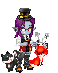
Just made a TWEWY OC
--- hehe, me and my friend enjoy the game, so we made OCs
[ making up stories of our characters being in TWEWY :") ]
So here's the work progress and the artwork
Concept
Sketch
Line Art
Base Colors
Final :"]
:"] you can comment, suggest, make an opinion, critic, or give a reaction about my work
:"] Hope you like it
|
|
|
|
|
|
|
|
|
|
|
|
|
|
|
Posted: Fri Jan 01, 2010 3:08 pm
I don't know what TWEWY is, but I still think I could make some comments on your design in general to tell you about my impression.
I definitely feel your progression from the concept to line work was an improvement. Tying his hair up like that adds a more Asian feel to the design, which I think you were going for with the talisman type charms around his neck. The shoes really look like an improvement to me, the extra details give a feeling like you really thought their design out. Also, their basic shape/silhouette is more appealing then the previous design.
Speaking of details, the dragon on his pants are really neat and I especially like the colour choices; they stand out nicely from the pants. I did find it a little weird that his eye brows were solid black while his hair was a light grey, but perhaps that was a style choice on your part? Anyways, just thought I would mention it since I found it stood out.
The anatomy seems to be working, I really like how he is on angle to create perspective instead of on a flat plain.
The two wrinkles on the front of his shirt/sweater kind of threw me off. It seems like you were trying to fill up some dead space, but I think you could have left it alone and the shading would have filled it in enough.
I find the shading really confusing over all. I think the totally black shadow shapes cover up some nice details you did, also they don't seem uniform through out the picture. I think they are on the shoe (or it could be my screen) then on his light grey hair, but not on his light grey/white pants. It's on the skin, but it's not on his dark red sweater. In conclusion, I think you might have gotten carried away with the use of solid black for shading. It can work, but I think you should have kept them to darker colours or all of the figure if you wanted a comic book feel.
I just noticed you don't have any highlights either. I only find this strange because with the solid black shading and the high contrast between the flat colours and the shadow colours that aren't black, it gives the impression he is being struck with a hard light. A hard light, like a spot light, something that would give a high contrast like what you have in the shadows, but it would also give a lot of glare off smooth surfaces, like his glasses as well as other areas that are closest to the light.
Adding in highlighting should also add form to your figure.
Sorry for being so long winded, but over all I think the concept came out quite well. He certainly seems like a character with life to him. Hopefully you found my comments helpful in some way (even though I don't know what TWEWY is) and perhaps you can use some of them in your next piece.
Keep up the good work.
|
|
|
|
|
|
|
|
|
|
|
|
|
|
|
|
|
|
Posted: Sat Jan 02, 2010 1:20 am
Thanks for the comment :"]
I was trying to do the game's style
which uses solid black shadows
but I did not know where to put em
got confused althroughout the shading part
thus the coloring became imbalanced
I will sure take note of that comment
It really halped me find out what's wrong with the picture :"]
|
|
|
|
|
|
|
|
|
|
|
|
|
|
|
|
|
|