|
|
|
|
|
|
|
 Posted: Tue Aug 25, 2009 4:17 am Posted: Tue Aug 25, 2009 4:17 am

............................................................................................CRIMPLED PAPERS
crimple's daily sketchbook
Hi GAM! Serve me up some critical opinions.
I'm always looking for new perspectives. Someone to show me my weaknesses and a way to do things better
At the moment I'm trying to step back and build on the foundations:
>>colour
>>form
>>space
>>composition
Browse through my recent works and let me know how well I'm doing?
For the most recent works, please jump to the latest pages
heart
|
 |
|
|
|
|
|
|
|
|
|
|
|
|
|
Posted: Tue Aug 25, 2009 4:38 am
WORK IN PROGESSUpdate : complete tea-set! Ta-dA!  Reference pic *note this picture was taken after the painting* 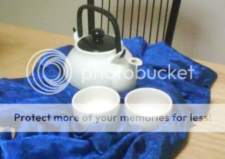 previous WIP shot
|
|
|
|
|
|
|
|
|
|
|
|
|
|
|
|
|
|
Posted: Tue Aug 25, 2009 6:27 am
Your art is quite good.
With the teacups, I think what you should do is darken the insides more, and have the highlights inside the teacups smaller and brighter, to give a more shiny effect. The highlights in flatten the teacups because it's inconsistent with the light source (it doesn't look like the light is going down and right in front of the objects, and if it is, then the teapot's spout needs to have a little more highlight on the inside. Plus, the teacups have no highlights on the outside, and the form shadows aren't blended right, which, again, makes them look 2d. The sharp shading on the fabric around the teacups is inconsistent from the rest, and as such draws attention away from them.
That is a pretty awesome teapot, though.
|
|
|
|
|
|
|
|
|
|
|
|
|
|
|
Posted: Wed Aug 26, 2009 6:22 am
Thank you so much! Your perspective helped heaps. I'll be keeping everything you mentioned in mind when I next work on it. Now that you've pointed me in the right direction I can proceed with confidence.
Eheh... pretty pround of that teapot. Yep ;D
|
|
|
|
|
|
|
|
|
|
|
|
|
|
|
|
Errol McGillivray Captain
|
Posted: Sat Aug 29, 2009 9:15 am
Wow. Looks great.
Hm, I think that the cups lack the definition in form that the pot has. Maybe go in with a finer brush and tighten your edges to make the shapes solid and consistent.
|
|
|
|
|
|
|
|
|
|
|
|
|
|
|
Posted: Mon Aug 31, 2009 12:25 am
Thanks Errol.
I was afraid to dive into details before I got the values, light/shadows of the cups correct. Sort of fudged my way through that, and yep, got in with a fine brush to further define it.
Please let me know how that went smile
|
|
|
|
|
|
|
|
|
|
|
|
|
|
|
|
|
|
Posted: Mon Aug 31, 2009 2:58 am
|
|
|
|
|
|
|
|
|
|
Posted: Fri Sep 04, 2009 5:43 am
|
|
|
|
|
|
|
|
|
|
|
|
|
Posted: Sat Sep 05, 2009 12:08 am
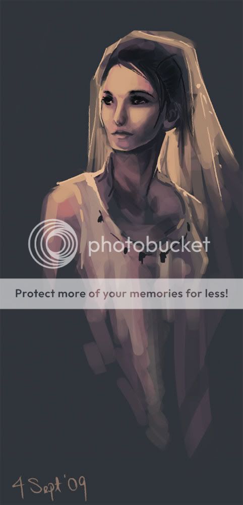
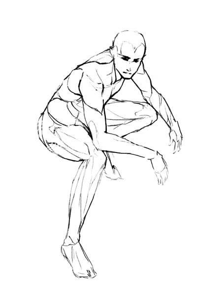
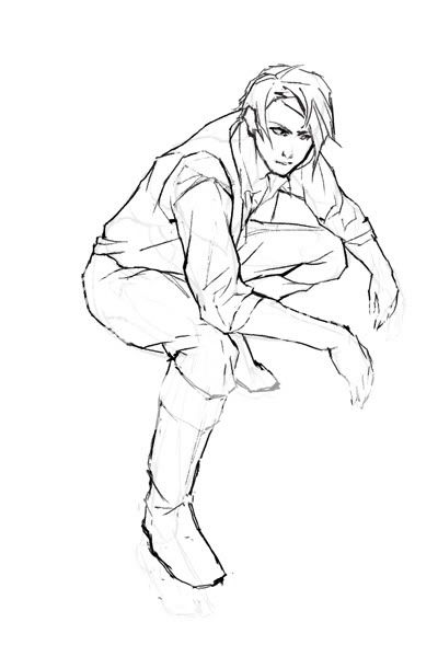
rough sketch for Preaeclaris' 2nd assignment... can a pose be dynamic without having the figure in motion? comments on anatomy? drawovers/red lines are loved! Anbu Kakashi. (I had had such a big crush on him. Please don't think less of me :'D) 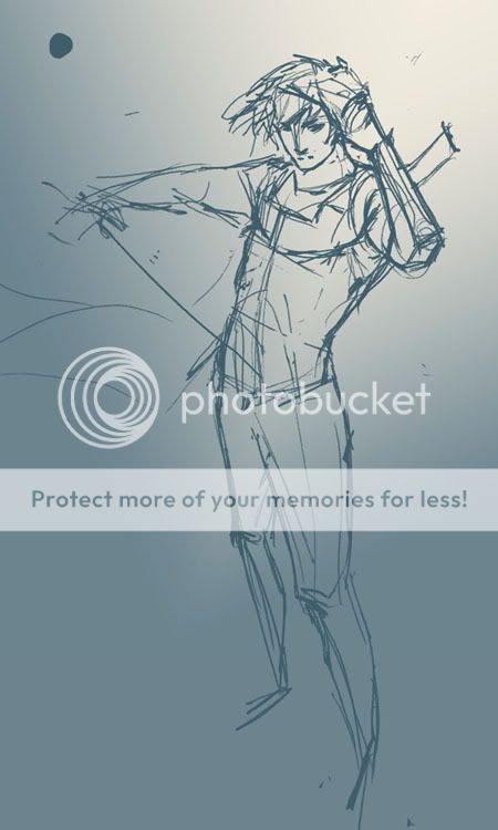
|
|
|
|
|
|
|
|
|
|
|
|
|
|
|
Posted: Sun Sep 06, 2009 7:05 am
omg I love your brush strokes ;3;...
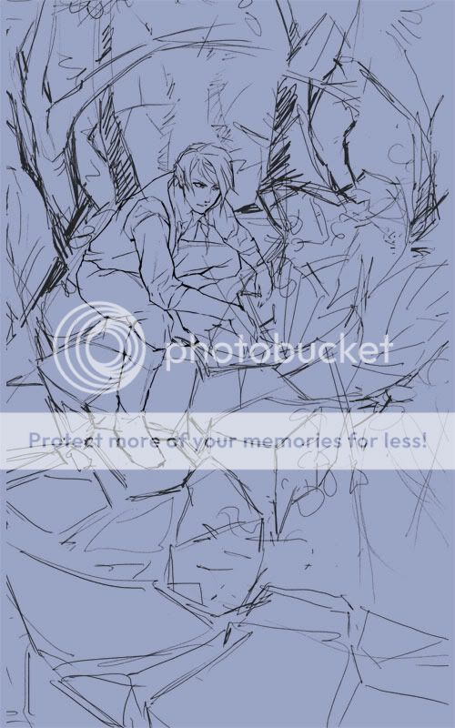
@ the last drawing: I'm liking the upper body, am not sure about the legs X'D...
sorry I don't have anything more useful to say OTL...
Can't wait to see more!
|
|
|
|
|
|
|
|
|
|
|
|
|
|
|
|
|
|
Posted: Sun Sep 06, 2009 10:39 pm
Oh thank you! I'll look over his legs and see what can be done pirate And new siggie! I love my Keely whee heart heart heart 
|
|
|
|
|
|
|
|
|
|
|
|
|
|
|
Posted: Wed Sep 09, 2009 10:55 am
|
|
|
|
|
|
|
|
|
|
|
|
|
Posted: Wed Sep 09, 2009 9:14 pm
1 min figure sketches/scrabbling/grasping around blindly/total confusion crying 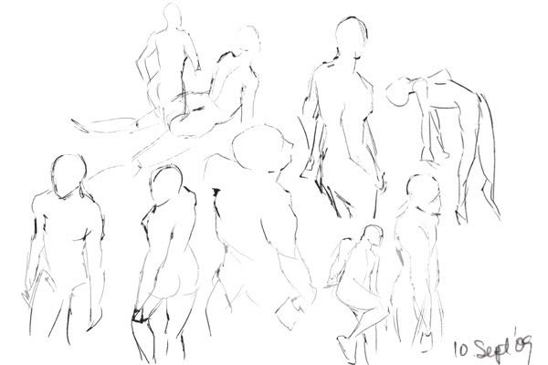
|
|
|
|
|
|
|
|
|
|
|
|
|
|
|
Posted: Wed Sep 09, 2009 9:41 pm
Crimplicious. I finally figured out where I knew your username from; you've improved a lot in the past couple years, and you were fantastic even then! : D
|
|
|
|
|
|
|
|
|
|
|
|
|
|
|
|
|
|
Posted: Fri Sep 11, 2009 10:23 am
Thank you so much! That is the most inspiring compliment whee
|
|
|
|
|
|
|
|
|
|
|
|
|
|