Welcome to Gaia! ::

Gaian Art Mentors

Back to Guilds

Where artists are paired in a mentor/mentee fashion to share their knowledge. 

Tags: artists, mentor, mentee, learning, drawing 

Reply Sketchbooks [Get crits here! Open to everyone]
Anpu's Sketchbook (Updated 01/24/11) Goto Page: 1 2 3 4 [>] [»|]

Quick Reply

Enter both words below, separated by a space:

Can't read the text? Click here

Submit

Do you like my style? Is there potential?
Don't quit your day job. Drawing's not for you...
11%
 11%  [ 3 ]
Sure, just keep at it...
88%
 88%  [ 24 ]
Total Votes : 27


Anpu the black Seraph

PostPosted: Mon May 19, 2008 2:09 pm
burning_eyes This will be my Gaia sketch journal.

Me:

I've been drawing since I can remember, prob since I could hold a pencil. Only since I've gotten older I've kinda let myself fall out of practice. I know I have a lot of work to do to get where I want. Unfortunately the only training I've had is what I've taught myself. And thats not enough anymore. I need to get myself into a daily routine.

So far I'm mostly a pencil artist. Occasionally I use markers or colored pencils, and every now and then I like to fool around with computer coloring.

-I can take criticism as long as there's a real point, not just bashing. So let it rip. If u have a legitamate suggestion, go for it...

What I want critiques in most:
-Anatomy
-Proportion
-Shading
-Perspective
-Backgrounds/landscape (or lack there of)
(Anything and everything else )

What I know I need improvement on:
-Faces
-Overall poses
-Composition
-General anatomy
-Proportion
-Shading
-Perspective
-Backgrounds/landscape (or lack there of)
-Coloring

Grazi. Thanks for lookin out. burning_eyes
 
PostPosted: Mon May 19, 2008 2:40 pm
Characters based on a couple of the books I'm writing. Mostly comic/graphic novel type stuff...

Lezriel- Apprentice

User Image

Lezriel Moon

User Image

Blood Moon

User Image

Adrienne

User Image
 

Anpu the black Seraph


Crisscoula

1,050 Points
  • Signature Look 250
  • Gaian 50
  • Member 100
PostPosted: Tue May 27, 2008 2:10 pm
You have good potential! you've got basics pretty much there, the only thing i suggest is to work on faces. The most important part of when drawing a human is the face, if that looks perfect then you can exaggerate the body how you like. There are hair-dressing magazines you can use to just copy faces over and over for at least a year. Thats how i learned any-way.  
PostPosted: Sat May 31, 2008 12:13 pm
The first thing I noticed when I was looking a the first picture was the shoulders. That might work for a different angle or if he were lifting somthing but there doesn't seem to be a reason why his shoulders would slope that far down. His hands seem to be too small too.

I like the line weights, the details, and the backgrounds.

The last picture:
It seems like the face looks like it should be at a 3/4 angle only the eyes nose and mouth are drawn from the front view.  

mangachan


apiyo

Blessed Hunter

9,100 Points
  • Money Never Sleeps 200
  • Brandisher 100
  • Treasure Hunter 100
PostPosted: Mon Jun 02, 2008 4:31 pm
The last two pictures look very confusing because the line weights don't vary enough. Every thing runs together when you don't put variations in the outlines.  
PostPosted: Wed Jun 04, 2008 1:10 pm
I think you should start solidifying general shapes (especially in the body) before worrying about detail. Everything looks like this mass of lines that's really hard to read. Also, vary your line weights with purpose to show not just distance, but depth and texture. Also, you can overwork detail. If you have detail detail detail without open spaces for the eyes to rest, you're killing your hard work.

What you want it a rhythm in line and shape that will lead people around the picture.

I think you should date your posts as well so we can see progression. Also, the next thing you do, please link to a large version. I'd like to do a deep crit that covers design and storytelling.  

Errol McGillivray
Captain


Anpu the black Seraph

PostPosted: Sat Jun 07, 2008 3:27 pm
Thanks everyone for the comments and suggestions thus far...

Crisscoula-

I actually think using a hair magazine is a great idea. I plan to add it into my rotation of exercises. And your suggestion to focus on faces is one I will most definately listen to. I have a small day planner that I will use to assign myself daily drawing assignments. Im gonna make room to add the hair mag into the mix.

mangachan-

I've been told by others who viewed the first image that the basic anatomy is off and that I should do some life drawing. I totally see what your talking about with the shoulder and hands. I understand what you mean with the face of the girl too. I really didn't notice until you mentioned it, but I definately see what your talking about. It
s funny that you like the backgrounds. Those are probably two of the only drawings I've actually been able to do backgrounds for. Thanks a lot.

apiyo-

Yeah, I've just started, like this week actually, working with different line weights and it makes a heck of a difference. I've really just started focusing on it so it'll be a while before I probably get the hang of it. Appreciate it.

Errol McGillivray-

I see what you mean about my bodies. Most of them don't look very three demensional. I'll have to try your suggestion. The hard thing is I tend to draw to dark when I sketch. I have to become looser when planning out a sketch and, as you suggested, solidifying the general shapes of the body before worrying about detail. As I said to apiyo, I've just started really working with line weights. I'm not really sure what you meant by a link to a large version. I really would appreciate any deep crit. Of course your suggestions so far have been a great help. Thank you.

From now on I'm going to start dating my drawings to show progression.
 
PostPosted: Sat Jun 07, 2008 3:50 pm
Here are a couple of my newer sketches. I tend to start several drawings at once and work on them over time, so the dates are rough estimations. From now on I'll start recording the start and finish dates.

On these next two drawings I've actually tried to practice using different line weights. I'm not sure if it's going ok though. Course it's a step forward.

I have done other sketches, practices, so don't think I've just done nothing in the gaps of time. These drawings are just of my own characters so they mean a little more.


User Image
approx. March 2008 - June 5 2008


User Image
approx. May 28 2008- June 6 2008
 

Anpu the black Seraph


Ramdragn

PostPosted: Tue Jun 17, 2008 10:56 am
Hi-

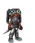
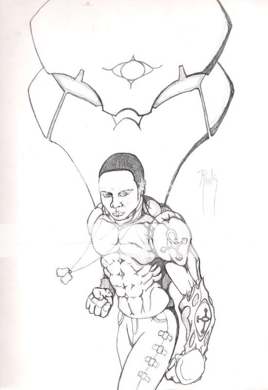
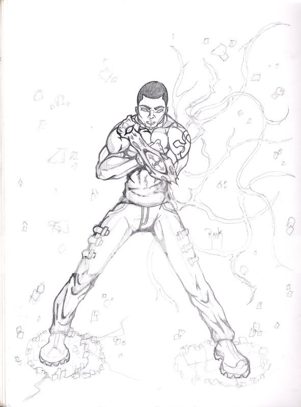
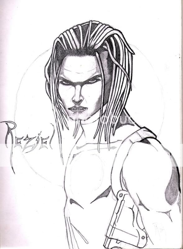
I think you got a really good graphical line stroke. Very Comic like. however, some things go overboard with the line. In my opinion, you could use a more smooth line for the end of the abdomen.

User Image - Blocked by "Display Image" Settings. Click to show.

It seems as if it was paper being bended by the pants on the abdomen at the left of the image.

Also, I don't think you need the line to define the shoulder muscle, the chest, back, and neck muscle does a very good job doing it. Unless is a scar or a mecha arm lol (sorry if it is.)

The tattoo can use some curves as well. It goes with the muscle . Just like your arm thingy.(can't draw it well with this mouse but you get the idea >.<)

and, what is the line filled shape between the waist and the arm, It makes the shadow from the pants to the waist look as if its floating.

Over all, its awesome. To my eyes at least

-Thank You  
PostPosted: Tue Jun 17, 2008 12:01 pm
Yeah Ramdragn. I see what you mean. I've kinda been told a lot that I should work more on the overall form, making it flow, before I start worrying about detail. Thanks for the critique, especially the red lines. Love em'.  

Anpu the black Seraph


Anpu the black Seraph

PostPosted: Sat Jun 21, 2008 11:33 am
Some random drawings from my portfolio/ drawings of actual people. Just wanted to know what everyone thinks... They're actually a few years old though.


User Image

A sketch of Jessica Alba.


User Image

Some goth girl from a magazine...
 
PostPosted: Sat Jun 21, 2008 3:06 pm
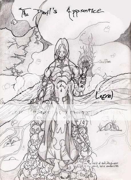
For this one: You might want to change the stance: one leg at the back, one leg in front. The upper body is fine, lower body just looks like he's standing there. If you changed the stance it would look like he was ready to bounce at you, which will be better.

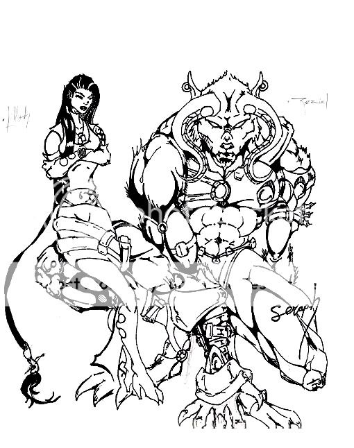
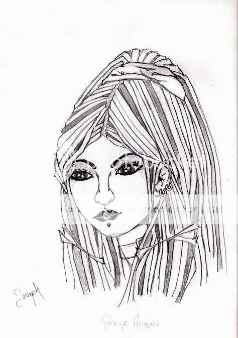
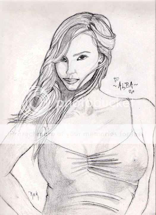
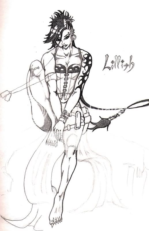
For this one: Mouth problems. On this one it looks somewhat symetrical, but it shouldn't. Her head is 3/4, so there's some perspective change.

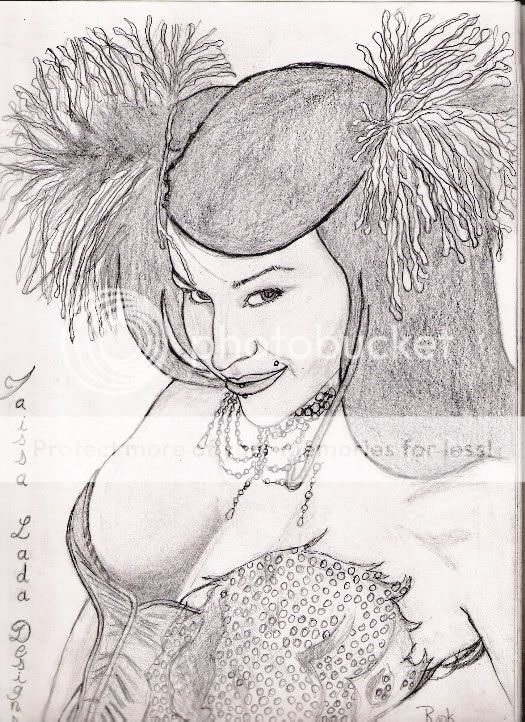
For your life drawings, I feel that there are too many uses of line instead of values, and that too many areas are left blank (skin is coloured, and not white, so it should be shaded everywhere, even the highlights aren't completely white).

Hope it helped.  

Mogtoats


Errol McGillivray
Captain

PostPosted: Fri Jul 04, 2008 6:26 am
I'm sure you can take time out to do something new. There is no point in critiquing something you did YEARS ago. Your eye would have developed and you will probably do a better job now.  
PostPosted: Sun Jul 13, 2008 4:33 pm
I spent most of my time working on the facial features. Im not sure what I wanna do with the rest of him.

6/27/08User Image


Havent really started the background for this pick but I like the pose so far. Kinda my vampyre huntress.

7/13/08User Image
 

Anpu the black Seraph


Mogtoats

PostPosted: Mon Jul 14, 2008 2:06 pm
First one: His face is skewed! However, good job on the expression.

2nd one: Plaques don't fly like that... I'm not sure about the position of the left thigh (our left). Maybe move things in a bit? The foreleg looks fine though, just not the back part.

You might want to start relying less on lines an more on values to define shadows and highlights.  
Reply
Sketchbooks [Get crits here! Open to everyone]

Goto Page: 1 2 3 4 [>] [»|]
 
Manage Your Items
Other Stuff
Get GCash
Offers
Get Items
More Items
Where Everyone Hangs Out
Other Community Areas
Virtual Spaces
Fun Stuff
Gaia's Games
Mini-Games
Play with GCash
Play with Platinum