|
|
|
|
|
|
|
|
|
 Posted: Thu Mar 06, 2008 12:31 pm Posted: Thu Mar 06, 2008 12:31 pm
|
|
|
|
|
|
|
|
|
|
|
Posted: Thu Mar 06, 2008 1:00 pm
 |
|
|
|
ART RELATED
I started drawing when I was around four, don't know the exact time, just that I started drawing and writing around the same time. I've been improving almost soley by catching bad habits (which can take a while with no artistic feedback) and a helpful semester of highschool Art I. I originally joined DA to get artistic feedback ( rofl ). That's where you guys come in.
My DA I draw a fair amount of manga-styled art, yheah yheah, "draw realism first", I've heard it before, too bad noone told me 10 years ago. Seriously though, I'm trying.
Things I'm working on:
Anatomy
Shading and Colouring
Dragons
Real animals
Designing (as in clothing, for characters)
Machinery
Guns, Armor and weaponry
|
 |
|
|
|
|
 |
|
|
|
|
|
|
|
|
|
|
|
|
|
|
|
|
|
|
|
|
|
|
|
|
|
|
|
|
|
|
|
|
|
|
|
|
Posted: Fri Mar 28, 2008 10:40 am
|
|
|
|
|
|
|
|
|
|
|
Posted: Sun Mar 30, 2008 8:33 am
|
|
|
|
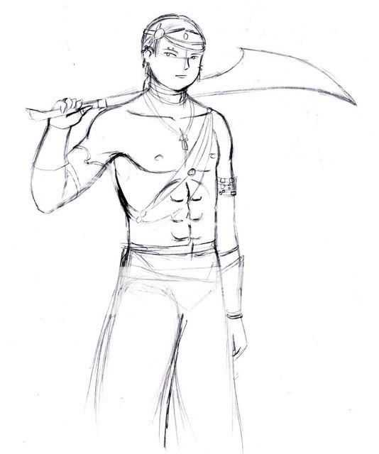
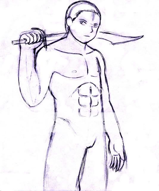
I really like the simplicity of his features and the linework. Don't loose that feeling as you work on the body that you have in the head. You'll want things to be consistent.
Building on this, I think you should try to minimize details to what you need to suggest form, rather than have too many lines that aren't supporting what's going on. That may be starting to happen around his abs and rib cage. The lines are hard and suggest edges rather than different slopes of his body.
I won't get into anatomy too much because you can see a lot of it yourself if you compare this to a reference shot of a guy with a similar build. There are some things that stay consistent. Hands are generally much larger than people think they are. Spread your fingers out and put your hand on your face. You can feel just how big it is. (And there's no feet in here, but the foot is about the same length as the inside from your wrist to elbow.)
One thing that I notice is that he's very flat. Sometimes, I put a little bounding box around my drawing to check and make sure that all of him is in the same perspective. Because of the turn, I feel that his elbow should be coming towards the viewer more, so there would be more foreshortening in his arm. His hips look a bit wide, and all, males have flatter hips, so the boxness is more visible. Be sure that in a static stance like this, his hips are in the same perspective as his torso.
One last thing on overall design too. Black in the guy on another layer. The shape should still tell you what's going on and be interesting without inside details. Be sure that his design has a good silhouette. (A lot of people don't do that and end up with boring looking drawings. Same with weapons.)
I think this is coming along nicely.
|
|
|
|
|
|
|
|
|
|
|
Errol McGillivray Captain
|
|
|
|
|
|
|
|
|
|
|
|
Posted: Sun Mar 30, 2008 11:46 am
|
|
|
|
|
|
|
|
|
|
|
Posted: Sun Mar 30, 2008 11:57 am
|
|
|
|
|
|
|
|
|
|
|
Errol McGillivray Captain
|
Posted: Sun Mar 30, 2008 12:04 pm
|
|
|
|
|
|
|
|
|
|
|
|
|
|
|
|
|
|
|
|
|
|
Posted: Wed Apr 16, 2008 3:36 pm
|
|
|
 |
In the first picture, the face is probably the weakest part at the moment, it does (as you say) look very child-like. Were I to be tackling it, I would probably raise the indent of the cheek on the right side of the face, to give the impression of a longer, less rounded face.
I would also, but I by no means claim this part as being the correct course of action, try moving the ear further in to the right, to make the left jaw line look "longer." I would probably move the rightmost "connection part" of the ear to roughly where the bit of sideburn-hair is right now, and then develop the musculature of the neck from there.
The abs and chest are good, but would probably look better if the waist and legs were more defined.
I would probably bring in the line that goes "behind" his arm on the left, given the angle, but that also depends on how stout you want the character to look.
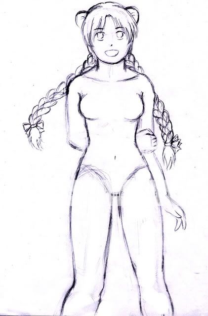
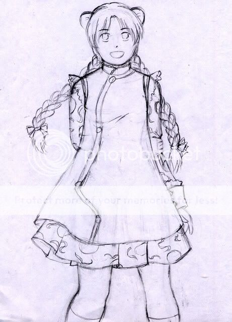
On the second picture, how to go about the nose depends mostly on what style you want to complete the image in. If you want it to look very anime - as the eyes currently suggest - the single dot is acceptable. Two dots would also be acceptable, as would a sort of down-facing triangle shape accompanied by a line along the left or right side.
Additionally, her right breast is lower than her left.
|
|
|
|
|
|
|
|
|
|
|
|
|
|
|
|
|
|
|
|
|
Posted: Thu Apr 17, 2008 4:06 am
|
Errol McGillivray Captain
|
|
|
|
|
|
|
|
|
|
|
|
Posted: Thu Apr 17, 2008 5:07 am
|
|
|
|
|
|
|
|
|
|
|
Posted: Fri Apr 18, 2008 9:55 am
|
|
|
|
Detailing smaller pieces can also be good practise. If you're worried about how much paper-space you've got, you also have the option of tilting the paper 45degrees. Drawing between these two corners will get you a little bit more length.
Regarding what Errol McGillivray mentioned about the girl's hips/thighs, I was going to link you to a tutorial I'd found particularly influential on the topic, however, it appears that this tutorial either never actually existed, or I misremembered who the author was.
The former seems slightly more likely, and I'm left to suspect that I'd merely inferred this information from the red line-overs in steps 7, 8, and 9 of this unrelated article. (It's a tutorial on drawing breasts and the very last step has a coloured n****e, viewer discretion is advised.)
Note the indented lines on either side of the stomach/waist/hips, sort of hinting at actual body mass. The artist's style is such that it's difficult to put this into perspective with real people in mind, but nonetheless, the indentations would seem to indicate that her silhouette isn't completely smooth and uniform.
|
|
|
|
|
|
|
|
|
|
|
|
|
|
|
|
|
|
|
|
|
|
|
Posted: Wed Apr 30, 2008 2:23 pm
|
|
|
|
|
|
|
|
|
|
|
|
|